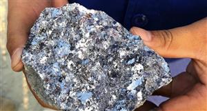
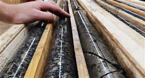
This one is a go at looking at the progress from aquisition to now from a well perspective.


I thought this one was interesting as it shows the gradual increase in wells producing and some variance in availability when they first come on line. Sorting is from largest bopd to lowest and the ones on right have no prodn.
Hopefully it adds to our understanding.
Cheers