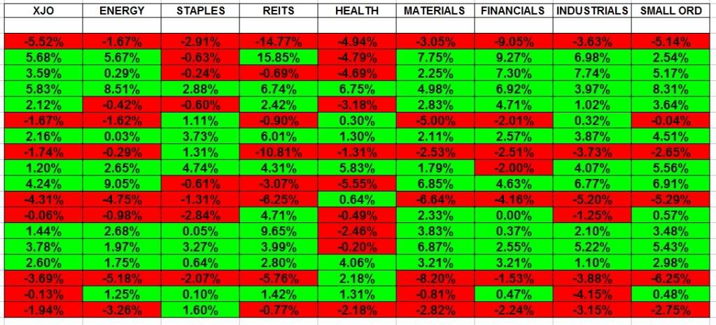
The first chart is a look at the XJO and indexes since the MArch low looking at how they perform individually
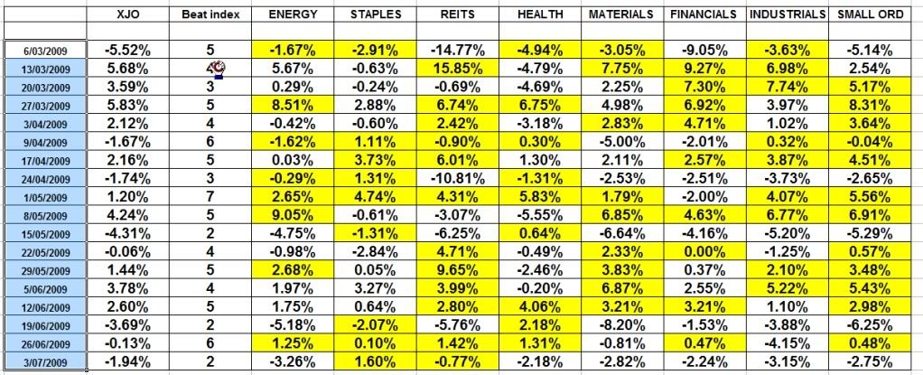
The 2nd chart highlights the sectors which beats the index in each week
The 3rd chart highlights the best sector for each week and tallies the results to show the difference/benefits in sector rotation.
Sector rotation is 6.5 times the XJO
The 4th chart shows the period since the sideways period began in May shows once again the sector rotation .
Sector rotation is 14.6 time the XJO, and highlights even more the benefit of this approach
Yes i have shown and tallied the best sector to be in each week, but gee even if you had the 3rd best each week, i think its fair to say you would be doing better than "money in the bank"
The figures are based on the simplest of weekly entries, you buy the open and sell the close of the week.
For me, to lock up shop in May would be a waste 60 days of fruitful investing. We all know the world economies are not doing so well, but as investors/traders i hope this highlights the opportunites within as opposed to the nervous/cautious nellie approach.
Regards
Rob
Add to My Watchlist
What is My Watchlist?


