Thanks for the comments guys. Good feedback. The grey square represents tin but any metal really as they may explore for more resources in the future. Commbank? A little, sure but not a bad thing eh? Banks' logos are designed to look solid and dependable. I might send it to the company on spec. I'm a freelance graphic designer and could do them a decent website too (god knows they need it) but I might see what they think of this first.
cluff website , page-8
-
- There are more pages in this discussion • 14 more messages in this thread...


You’re viewing a single post only. To view the entire thread just sign in or Join Now (FREE)
Featured News
Add CFR (ASX) to my watchlist
Currently unlisted public company.
The Watchlist
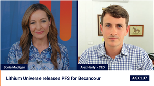
LU7
LITHIUM UNIVERSE LIMITED
Alex Hanly, CEO
Alex Hanly
CEO
Previous Video
Next Video
SPONSORED BY The Market Online