XJO charts and some commentary for your consideration.
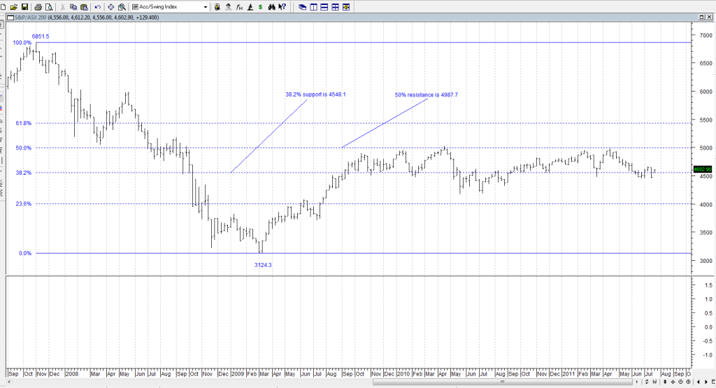
First the weekly to get a wider perspective with some prices marked which follow through as we zoom in. Important to note 4548.1 as major long term support
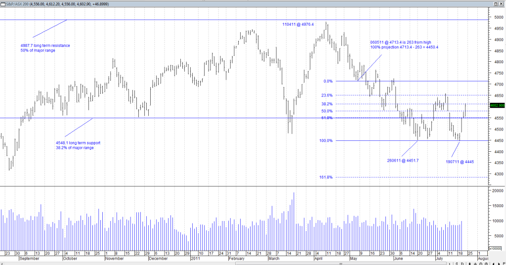
Next the daily for the past year with the focus on the recent move down from the April high. Interesting to note the recent lows were a 100% extension of the move down from the 11 April high to the second lower low on 6 May. The first 263 point move down was 25 calendar days (16 trading days). As to the second 263 odd point move down from that low, it then took another 51 calendar days (30 trading day) to reach the 27 June low. So it took twice as long to cover the same point range clearly evidencing a weakening of the down trend.
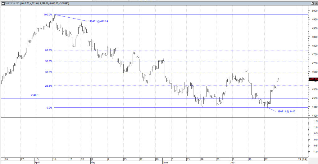
Next we zoom into the 2hr chart from the April high which gives a clearer view of the move down. We want to answer the question, "Is the move down done?" It is obvious from the chart that the market grinded into the 27 June low. If that is not obvious to you, it will be after doing the exercise I recommended to Robbo the other day. It really struggled to get down there. There was no capitulation panic selling, it was all very orderly (unusual for the Aussie index).
After that low (27 June), there was a small higher low and then it popped up into the high around 4650 and then the fast move down again into the 19 July low at 4445 and that to me was the capitulation when the panic happened. That to me probably washed out the last of the weak hands. It also marginally broke the previous low (false break) which would have stolen the stops set at or just below the 19 June low.
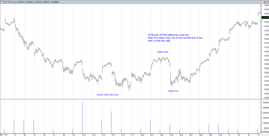
So what now? Okay, if you don't already know, patterns in charts are ALWAYS repeating. If you don't see them repeating in the charts, you will if you complete the exercise I recommended to Robbo the other day. So here is the SP500 30 minute and the fall in June 11 into the recent low. Do you see a similarity of how that market moved into that low? Now see the outcome. Of course nothing is a given, and I know the SP500 has more of a curve to it, but we are playing with probabilities here:
- Forums
- ASX - By Stock
- XJO
- xjo weekend zoomba lounge
XJO
s&p/asx 200
Add to My Watchlist
0.32%
 !
8,773.5
xjo weekend zoomba lounge, page-40
Featured News
Add to My Watchlist
What is My Watchlist?
A personalised tool to help users track selected stocks. Delivering real-time notifications on price updates, announcements, and performance stats on each to help make informed investment decisions.
 (20min delay) (20min delay)
|
|||||
|
Last
8,773.5 |
Change
28.300(0.32%) |
Mkt cap ! n/a | |||
| Open | High | Low |
| 8,745.2 | 8,821.0 | 8,745.2 |
Featured News
| XJO (ASX) Chart |
