
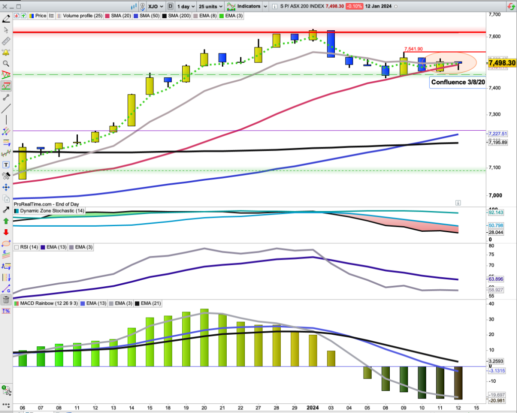
XJO DAILY CHART - Key Chart to Watch.
Three important Moving Averages have now almost joined together, 3-DEMA, 8-DEMA and 20-DSMA. There is just a hair's breadth between the MAs.
In the Very Short Term, the bias is bearish with the 3-Day EMA nudging below the 8-Day EMA. That bias is clearly evident looking at the chart. Recent high was at 7628 on a closing basis (2/1/2024). XJO is currently at 7498, down -1.67%.
The high on 2 January was followed by a bearish engulfing candle - and the Oz market has been weak since then.
For the past week, XJO has been in consolidation mode and over the past four days, the daily range has been steadily decreasing. Something will give in the very near future.
Short-term, the XJO has a narrow consolidation band, High 7542, Low 7455. Watch for a break-out of that range - one way or the other.
If the Chart breaks lower, we'll probably see a quick run down to the 50-Day MA at around 7230, a loss of around -3.5%.
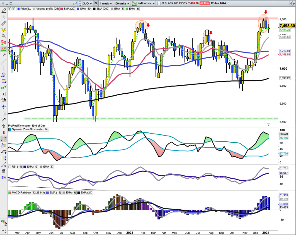
Daily Chart for IOZ (a tracking ETF for XJO)
The Chart above is a Candle Volume Chart with overlays of the Volume Profile (left-hand side of the chart) and an Andrew's Pitchfork which provides a specialized trading channel.
The Chart for IOZ is a little more pessimistic than the XJO. The 3-Day EMA is below the 8-Day EMA, so the Very Short Term Bias is down. The 8-Day EMA is also below the 20-Day SMA - so the Short Term Bias is also down. That needs to be confirmed by a break below horizontal support 29.90. IOZ is currently at 30.05. So not much of a drop to take the IOZ below horizontal support - in round figures, about 0.5%.
The chart has fallen below the lowest level of the Andrew's Pitchfork - a bearish move.
The current fall was well telegraphed by the Negative Divergence on the 13- Day MA of the Force Index. FI is now sitting down around its zero line where it's been a couple of times during this bull market rally. A definite fall below the zero line and we'll be into medium term bearish country.
Once a chart enters a Volume Void, falls usually accelerate. The Chart isn't there yet, but it's not far off.
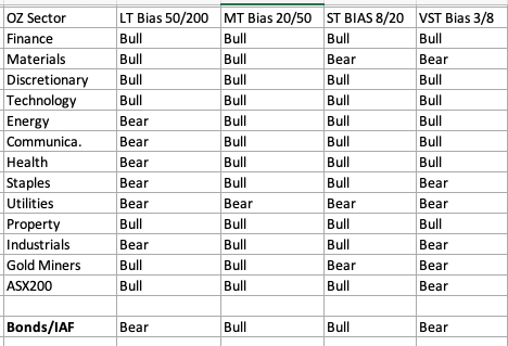
Watch.Sector Bias: Bull or Bear?
Various terms are used to describe the market bias. "Golden Cross" and "Silver Cross" are two well known terms to describe the Long Term and Medium Term Bias of the market.
A "Golden Cross" occurs when the 50-Day MA crosses above the 200-Day MA.A "Silver Cross" occurs when the 20-Day MA crosses above the 50-Day MA.
A short term bullish bias occurs when the 8-Day EMA crosses above the 20-Day EMA.
A very short-term bullish bieas occurs when the 3-Day EMA crosses above the 8-Day EMA.
All of these factors are valuable depending on your trading style and can suggest changes in trend. They are also useful for understanding breadth in the market.
Here's a tabular look at the various biases for each sector, plus the XJO, Gold Miners and Composite Bonds.
ASX200 (XJO) has recently experienced a change in its Very Short Term Bias from Bullish to Bearish. That could be the start of a cascade lower (or not).
The other three time frames (Long Term, Medium Term and Short Term are all bullish.In the Medium Term all Sectors Plus Gold Miners, ASX200 and Bonds are bullish except for Utilities. (Utilities, XUJ, is bearish on all time frames.) That's a picture of a healthy market, and the Short Term Bias is also healthy with only two sectors in bearish territory.
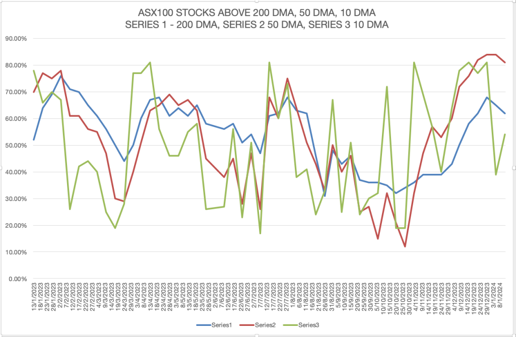
ASX100Stocks above Key Moving Averages.The most important statistic to watch in this graph is the % Stocks above the 50-Day MA (Series 2). Overbought on this item is above the 70 % level. That occurred back at the beginning of 2023 and the beginning of August 2023.
I've marked both of those times on the Chart of the XJO below.Each of those times we had a big yellow (bullish) candle followed by a big blue (bearish) candle which then started a bearish reversal. The one beginning in August didn't finish until the beginning of November.
This time around, %Stocks above the 50-Day MA have been in overbought state for the past six weeks. That's some indication of how strong the current rally has been.
Now the %Stocks above 50-Day MA has this week rolled over. On the chart of the XJO we can see we've had a big yellow(bullish) candle followed by a big blue (bearish) candle. Past history suggests we will see more down side.T
hat makes it imperative that traders now monitor the confluence of Moving Averages shown on the first chart today (20-Day SMA, 8-Day EMA, 3-Day EMA). A break lower from that confluence will almost certainly begin a cascade of the index lower.https://wordpress.com/post/australianmarketreport.wordpress.com/21468
Good luck
XJO DAILY CHART - Key Chart to Watch.Three important Moving...


Add XJO (ASX) to my watchlist
 (20min delay) (20min delay)
|
|||||
|
Last
7,575.9 |
Change
-107.100(1.39%) |
Mkt cap ! n/a | |||
| Open | High | Low |
| 7,683.0 | 7,683.0 | 7,568.1 |
| XJO (ASX) Chart |