very tricky no trick zone
while some of the graphs do show temperature decreasing in some areas some are deceptive misrepresentations.
This is one of the graphs.
Jopo, you seem to fancy yourself as a mathmetics/statistics buff. Does this graph from your link represent decreasing or increasing temperature for the time period of the trend.

50 peered reviewed temperature charts, page-5


Featured News
Featured News
The Watchlist
VMM
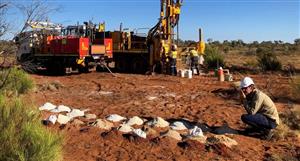
VIRIDIS MINING AND MINERALS LIMITED
Rafael Moreno, CEO
Rafael Moreno
CEO
SPONSORED BY The Market Online