I believe in primary school I was taught how to read the legend on a chart...
The green line denotes... a border.... of the land owned by the project. I am not sure whether or not a fence will run along the green line denoting the project's border or closer to the actual wind turbines... but you are?!?
Given that the article mentions the "Kalgoorlie, Boulder and Esperance", giving an attentive reader a pretty good idea where the project is located. Why duplicate that information on the map (unless you only look at pictures)?
Also, a quick look at the project location compared to the small map of Australia (just in case you really do not know where the mentioned cities are located), should give you a pretty good idea of where exactly the project is located.
However, if you have difficulty with this, I suggest you purchase the following. It is a device designed specifically for people with exactly your type of difficulty:
https://www.edresources.com.au/melissa-doug-shape-sorting-cube?gclid=Cj0KCQjwub-HBhCyARIsAPctr7x6e9CAlwgWua3qO4c0vsjoDxHKRy46LEgvV9UHrKMzYipQ7WWg5vIaAjXdEALw_wcB
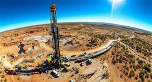
I take some "visual pollution" from renewable energy over the countless deaths from fossil fuel power supply any day... and apparently so do the Mirning traditional land owners.
Accelerate the World's Transition to Sustainable Energy - to fight Anthropogenic Climate Change, page-610
-
- There are more pages in this discussion • 4,247 more messages in this thread...


You’re viewing a single post only. To view the entire thread just sign in or Join Now (FREE)
Featured News
Featured News
The Watchlist
CC9
CHARIOT CORPORATION LTD
Shanthar Pathmanathan, MD
Shanthar Pathmanathan
MD
SPONSORED BY The Market Online