Market News Published:
April 13, 2020 6:36 AM UTC Dow Futures Shiver as This Bubble Chart Predicts a Terrifying Crash
The stock market is a rising amid a worsening economic catastrophe. This bubble chart is a terrifying omen of what comes next. William Ebbs@ebbs_william
The Dow is set for a Monday opening fall after the U.S. stock market recorded one of it's best-ever weeks after rallying 12.7% in a weekly gain. | Source: REUTERS/Brendan McDermid
Dow futures point to a lower opening after the stock market posted a massive recovery last weak.
Stocks are ignoring the severe risks in the global economy and the potential for a second Great Depression.
The stock market is a bubble. And it’s repeating patterns last seen in the lead up to the stock market crash of 1929.
The year is 2020. A novel SARS-like disease has spread out of mainland China to infect over 1.8 million people around the world. The United States is the hardest-hit country with over 500,000 infected citizens — 1,830 of whom have died in the last 24 hours alone.
Experts believe the economy could shrink by a staggering 33.5% in the first quarter as mass lockdowns slow economic activity to a trickle. A collapse in the travel and hospitality sector threatens to create a domino effect of corporate bankruptcies, and unemployment may soon hit 20%.
Meanwhile, the stock market is rising. And if that sounds strange to you, that’s because it is. The stock market now looks identical to the way it looked in the lead up to the great depression. And we may be on the verge of the biggest stock crash the world has ever seen.
The Kindleberger-Minsky Bubble Chart
In 1979, economic historian Charles P. Kindleberger wrote a book titled ” Manias, Panics, and Crashes,” where he outlined the five phases of a financial bubble. Later, Canadian scholar Jean-Paul Rodrigue built on Kindleberger’s findings to develop a more detailed chart of how bubbles tend to unfold.
We are currently at the “return to normal” part of this chart. Research Source: Jean-Paul Rodrigue
Terrifyingly, Rodrique found that after prices reach their all-time high, they collapse into a “bull trap” before “returning to normal” only to resume an even deeper capitulation.
A quick look at the S&P 500’s 12-month performance shows that this pattern is playing out in the U.S markets.
The U.S. market is currently at the “return-to-normal” stage in the bubble chart. Data by Ycharts
A broader look at the S&P 500’s, three-year performance shows that this pattern has been going on for longer than many realize with the “first sell-off” occurring in late 2018 and early 2019.
The first “bull trap” occurred in late 2018 and early 2019. | Source: Data by ycharts.
The bubble seems to have started in 2016 with the election of Donald Trump. But many factors could be at play here, including the Federal Reserve’s historically low-interest rates.
Rates have been held at under 3% for over a decade. And this has allowed companies to use cheap debt to buyback stock. The massive debt loads have also left many companies unprepared for a potential financial catastrophe.
Is This 1929 all Over Again for the Dow?
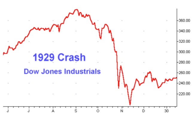
Today’s chart also shows disturbing similarities with the stock market in 1929, right before the stock market crash that led to the great depression. Then, just like now, stock prices returned to normal for a brief period only to capitulate into one of the worst Dow declines in history.
Stock prices briefly gained-ground only to capitulate into a multi-year long bear market for the Dow. | Source: Business Insider.
The Dow decline lasted for several years after the initial “crash.” Today’s market seems to be repeating this pattern. Image Source: Business Insider
Will America see the widespread poverty and economic devastation that it experienced during the Great Depression? Some economists believe we might already be there — it just hasn’t hit home yet.
According to David Blanchflower, an economics professor at Dartmouth College, unemployment numbers in the United States and Europe suggest the West faces its most significant economic catastrophe since 1929.
Between 1929 and 1933, the U.S unemployment rate rose from 3.2% to 24.9%, with the number of unemployed Americans soaring from 1.6 million to 12.8 million. Now, U.S jobless claims have already exceeded 16 million in just three weeks, and the crisis is just beginning. When it is all said and done, many experts believe the U.S unemployment rate will exceed the 25% record set in the Great Depression. What is the Difference Between a Depression and a Recession?
Recessions are periods of economic decline that last or at least two quarters while depressions are economic declines that last for years. With the global economy on lockdown for most of the first quarter, a recession is almost guaranteed.
But it will take an unexpected and devastating economic shock to tip the economy into a full-blown depression — a stock market crash may be the trigger.
TNG Price at posting:
5.5¢ Sentiment: Sell Disclosure: Held