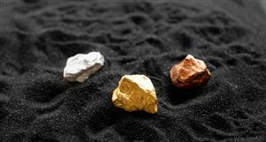
It’s the perceived proximity to production. To really compare market caps we need to see a market cap comparison over time. ARL started in 3rd place regarding that proximity perception so what you’re really talking about is has that market been supported as much or less than the other 2?
I wonder if Red’s chart, which list market cap, is a market cap chart? Do such things exist? If not then it’s something some of us might enjoy doing.
To do so we would need to be aware of-
A: starting market cap of each.
B: dilution of each along the way.
C: market cap performance over time up until the day of drawing the chart.
For me at least, that is an enticing- if daunting- endeavour.
Cheers for not taking what I said in reply the wrong way- that’s about the best we can hope for on the Internet, especially for ppl like myself who are very reliant on tone of voice & facial expression.
It’s the perceived proximity to production. To really compare...


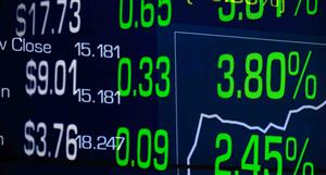


Add ARL (ASX) to my watchlist
 (20min delay) (20min delay)
|
|||||
|
Last
48.0¢ |
Change
0.015(3.23%) |
Mkt cap ! $95.84M | |||
| Open | High | Low | Value | Volume |
| 46.8¢ | 48.0¢ | 45.5¢ | $11.78K | 25.18K |
Buyers (Bids)
| No. | Vol. | Price($) |
|---|---|---|
| 3 | 81978 | 45.5¢ |
Sellers (Offers)
| Price($) | Vol. | No. |
|---|---|---|
| 50.0¢ | 23716 | 4 |
View Market Depth
| Last trade - 15.56pm 12/07/2024 (20 minute delay) ? |
| ARL (ASX) Chart |