T91, you have a way of getting into my head; that little rxm chart got to me.
Been thinking (and reading) about bloody action reaction lines all day (LOL) done a bit of recap on basic old p/f theory & what Mr Andrews has to say; must admit I had read the stuff on A/R and link to p/f's fairly scantily in the past; maybe the mention of Sir Isaac connection got me interested. Played with a few charts & have to say I AM impressed!
My (free) Hubb software is fairly limited as u can tell from the standard of the charts and it doesnt allow much scope with cool stuff like warning lines, a/r, & the like. You once recommended the chart overlay program from Omnium, just wondering is that what you still use/recommend to take charts to next level? (I gave the free trial a go and was impressed but decided I didnt need it at the time so did not buy it)
Anyway drew the chart below of ANZ (chose at random as the first chart in my data base) and I think it shows the power of the reaction lines. Its rough I know with the lines just positioned by my scaled arrows give a fantastic interpretation of where change in trends occurred. GOTTA LIKE THAT!
Totters, (or anyone) welcome a comment on the efficacy of the lines I have drawn?
This charting stuff is a little addictive.
GJ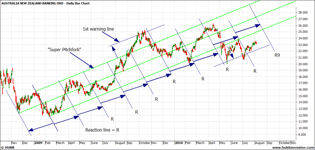
august week 1 2010, page-108
-
- There are more pages in this discussion • 69 more messages in this thread...


You’re viewing a single post only. To view the entire thread just sign in or Join Now (FREE)
Featured News
Featured News
The Watchlist
1CG
ONE CLICK GROUP LIMITED
Mark Waller, MD
Mark Waller
MD
Previous Video
Next Video
SPONSORED BY The Market Online