This time lets look at Bollinger Bands. I had someone ask me about them on another forum and I gave a brief explanation but I will put on something here with a little more detail to avoid blocking up the thread there.
I will state now that I'm not a strong maths guy; I like to use psychology to frame my trading rather than being strict and mathematical so please keep that in mind when you read any of this and spot errors in what I'm saying. However, it is important to understand what you are looking at when you look at any indicator on a chart to understand what it is exactly that you're looking at. So please be aware, whilst I am fuzzy on the maths, I try to be very clear on my interpretations of things.
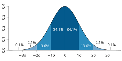
So bollinger bands are derived from Stochiastics which uses statistical analysis of the set of numbers making up moving averages, and the bollinger bands are based on this. I don't understand the formula but what is important to understand is that its showing you statistical variance of the data set. All data sets have all their numbers that fall within a range of about 2 standard deviations. About 60%-70% of all statistics fall within one standard deviation of the average and a further 25% fall within 2 standard deviations. This means that all statistical sets have about 90% of their constituent number sets falling within a range of 2 standard deviations, and any number outside this is an outlier. Its not perfectly true (it fact its pretty untrue), but think of the Bollinger Bands as showing you where a number would end up if it were 2 standard deviations away from the current data set that you have, its an analysis that works.
So lets pull that apart a bit more because if you a very light on maths that probably made no sense whatsoever. If you go and stand on the side of the road and count the number of cars that are for example white, over any given hour, of any given day, the amount of cars that will be white when you do the test again will be roughly the same every time. If you do that 100 times you will be able to plot your results and you will see all your results end up in a bell shaped curve. Most of the results are towards the center of the curve, which is the average number, and the further you go away from the average, the less results you have out there. Shown below.
This is pretty much what Bollinger Bands are showing you; the likely hood that the price you have was going to end up at this point of the statistical set of the average. So if the further your price is away from the average, the more likely it is that over time the trading is going to return to the average.
There are many ways that we can use Bollinger Bands, but like any indicator you should be careful about using them on their own; always try to use them in conjunction with other signals. Personally, I like to use them as sell signals, but its not the only way you can use them. Lets say that you bought a stock and it started to rise. What can happen sometimes is the buying pressure gain momentum and it may start rising like mad. If things get irrational in any market its a good idea to stick out of it because it can overheat and flop. So using our knowledge of Bollinger Bands and how they indicate statistical sets, if we have a massive price rise and it falls outside or even on the edge of the upper Bollinger Band, we know that the likely hood of it landing there again tomorrow is about 15%. You would only bet on a dog at the TAB that only had a 15% chance of winning if you hated the feeling of cash in your hand if the odds of making money were average.
When looking at the Bollinger bands as a sell signal like this it is sometimes important to view the chart on both the weekly and the daily view. What may be an outlier on the daily chart could well be within range on the weekly so you may have found yourself in the middle of a greater upswing if youre lucky, so it would be silly to sell early.
What I have found in my experience is that bollinger bands can also be used as trading ranges that show the momentum of the price direction. The price action tends to be distributed either above or below the 20MA that sets the bollinger bands, and as mentioned before, the stronger the move in a given direction, the closer it will be to the outside of the Bollinger Bands. A change in the direction of a trend can come about through the price action simply swapping from one side of the 20MA to the other, as this indications a change in the direction of the momentum. Ill get onto moving average another time, but just the simple act of the price action swapping over a moving average can be signal enough to indicate a change in momentum of a trend.
This chart shows a little set up you can use. This is by no means a perfect example or is this a perfect trading set up. In fact, it is a pretty poor set up in terms of profitability, but it is a handy little thing to have in your toolkit. Once you understand how the price tends to move within Bollinger Bands and what a heavy or weak move looks like by understanding what different different candle shapes you can start to predict with a degree of accuracy tops and bottoms in trends.
So, the chart. In the first chart we have Bollinger bands that suddenly go tight. As much as outliers are anomalies, so are consecutive number sets, so this is showing a statistical anomaly as well. As the Bollinger Bands tighten simple rules of statistics dictate that a change has to occur in a direction either up or down. At this point its good to know what fundamentals of a company so you can guess what is happening, whether some good or bad news is about to be released, or if the market has made a collective decision in this case to drop the stock. You'll notice that no sooner that the price has dropped from this tightening range and left the bollinger bands (one statistical outlier to another), so they spring back and return to normal trading. Both of these outliers were signals to you to do something.
The second circle circle, we see the price action cross the 20MA, this can be used as a buy signal, because it indicates a change in the price direction. Now look closely and you'll notice that after the price action touches the top of the bollinger band, it returns to the 20MA, whilst staying above it, it then goes back to the top of the Bollinger Band again. That little double touch can be used as a signal and confirmation that a new trend is in play. The price then runs up the Bollinger Band to a peak and drops at the third circle. There is another signal that there may be a change happening here with the big volume spike that happens on the upswing before the turn down.
Notice that the 4th candle is so far out of the normal trading that it falls all the way down to the yellow support line I put in. But then it goes back to trading regularly. Now again, this is not to say that any candle like this will return to the mean. There are examples scattered across this chart proving the exact opposite, but remember, Bollingers show statistical anomalies, and while such things are rare, they exist in about 15% of all data sets. So if that dogs got good odds on him, and there's a 15% chance he'll win; throw $5 on it and you might get a couple of jugs
On the 5th circle we see the price exit the bollinger bands and then that run up is over and it consolidates almost to the blue support line. Now have a look a the remaining price action and look to see how with simple price action and 20MA cross, combined with price action crossing out of the Bollinger Bands can make for a profitable strategy if you do it perfectly...... which you wont. It is not a way of confirming anything, but it is good to use as a signal in making the decision.
And just a final thing which sort of speaks more for statistics themselves than anything else. Look at the highest two peaks on that final move at the top right of the chart. The first peak ends up on the edge of the Bollinger Band, but the second is in the upper third of the Bollinger band. In terms of the number set established within that 20MA there is now a precedence of that price having been set so it becomes a value that is considered normal. The valley between these two peaks falls all the way to the 20MA (coincidentally?) and rebounds establishing this period as being very volatile so the width of these Bollinger Bands at this point becomes huge because the data set is hugely varied.
So Bollingers Bands pretty much just show us likely hood of where a number will fall next. The closer to the mean (average) the more likely that it will fall there again, however, consecutive number sets themselves are statistical anomalies so it can be an indication of a move itself. These set ups I've explained are nowhere near perfect, but they are useful in being able to get an idea of likely price moves.
These are things that I have established from experience, not from textbooks, so likely theyre all wrong
Again; not financial advice. If you think it is you're as stupid as I am drunk.
This time lets look at Bollinger Bands. I had someone ask me...


Featured News
Featured News
The Watchlist
CC9
CHARIOT CORPORATION LTD
Shanthar Pathmanathan, MD
Shanthar Pathmanathan
MD
Previous Video
Next Video
SPONSORED BY The Market Online