Live Chart
Trading volume also peaked at a new high of $7.66B on the 20 October, the day of the current price ATH. Traders moved an additional $490M worth of volume on CME futures relative to the previous peak set in Feb 2021.
Live Chart
Funding rates in perpetual swap futures markets also reached a new local high on the same day prices reached the $66k. This signalled that many traders were opening leveraged long positions amidst the excitement of the rally and ETF launch. As often happens during periods of exuberance and high leverage, prices quickly corrected, flushing out excess leverage, hitting stop-losses and returning funding rates to lower levels.
Note that funding rates remain at similar levels as observed just prior to the early September flush out. With futures open interest remaining near all time highs, a risk of further downside to clear even more leverage does remain in play.
Live Chart
Lastly on derivatives markets, and in a more constructive light, the proportion of futures margin collateralised by volatile crypto assets has continue to decline. Crypto-margined futures contracts have fallen from 70.1% in April (on the Coinbase direct listing), to 44.6% today.
The converse of this observation is that stablecoin or fiat collateral is now posted for 55.4% of futures open interest (vs 29.9% in April). This is a much healthier state of leverage across the market, where price volatility in the posted collateral is gradually declining in favor of stable value assets, and fiat currency.
Live Chart
Old Coins On The Move
Last week we covered the very early signs of older coins, reflecting more experienced long-term holders (LTHs), being spent and taking profits. This is typical behaviour around new price ATHs, and after another week of price action, we can reassess the state of this trend.
Long-Term Holder supply declined by around 39.5k BTC over the last two weeks. However when we look at this in context, it follows a period of incredible accumulation and HODLing, where LTH held supply increased by 2.42M BTC since the lows in March.
Current LTH supply is 680k BTC higher than it was this time last year, and even after the weeks spending, is starting to reverse back to the upside. This observation suggests perhaps LTH distribution has so far been more of an 'event', than a trend.
Live Chart
We can see the magnitude of lifespan destroyed by these older coins on the move in the Dormancy metric. Dormancy presents the average number of coin-days (lifespan) destroyed per unit of BTC spent that day. General interpretation is:
- Higher values mean older average age and typically indicates old coins are being distributed (typical in bull markets)
- Lower values mean the average age of coins is relatively young and is typical of bear markets and accumulation periods.
A pre-bull market Dormancy baseline of around 50-days was established throughout 2019-20. This gives us a reference point for what constitutes accumulation vs distribution. Incredibly, the accumulation from May through September shows up as extremely low Dormancy values, getting below 25-days in mid-September (strong accumulation signal). There has been a slight uptick in this metric over the last two weeks, however it continues to trade around the pre-bull baseline of 50-days, suggesting LTH spending is modest, but not extreme.
Live Chart
A similar pattern can be observed in the Binary Coin-days Destroyed metric which is beginning to trade higher on a 7-day average basis. This is again very similar to the behaviour observed in prior bull markets where LTHs commence distribution around new price ATHs. A similar pattern is observable from October 2020 to Jan 2021 during the rally from $10k to $42k.
Live Chart
The Realised Cap HODL waves confirm the above observations as younger coin bands (warmer colours) have seen a slight uplift. As older coins are spent, a larger realised value of coins move into these younger bands, and older bands will shrink proportionally.
Live Chart
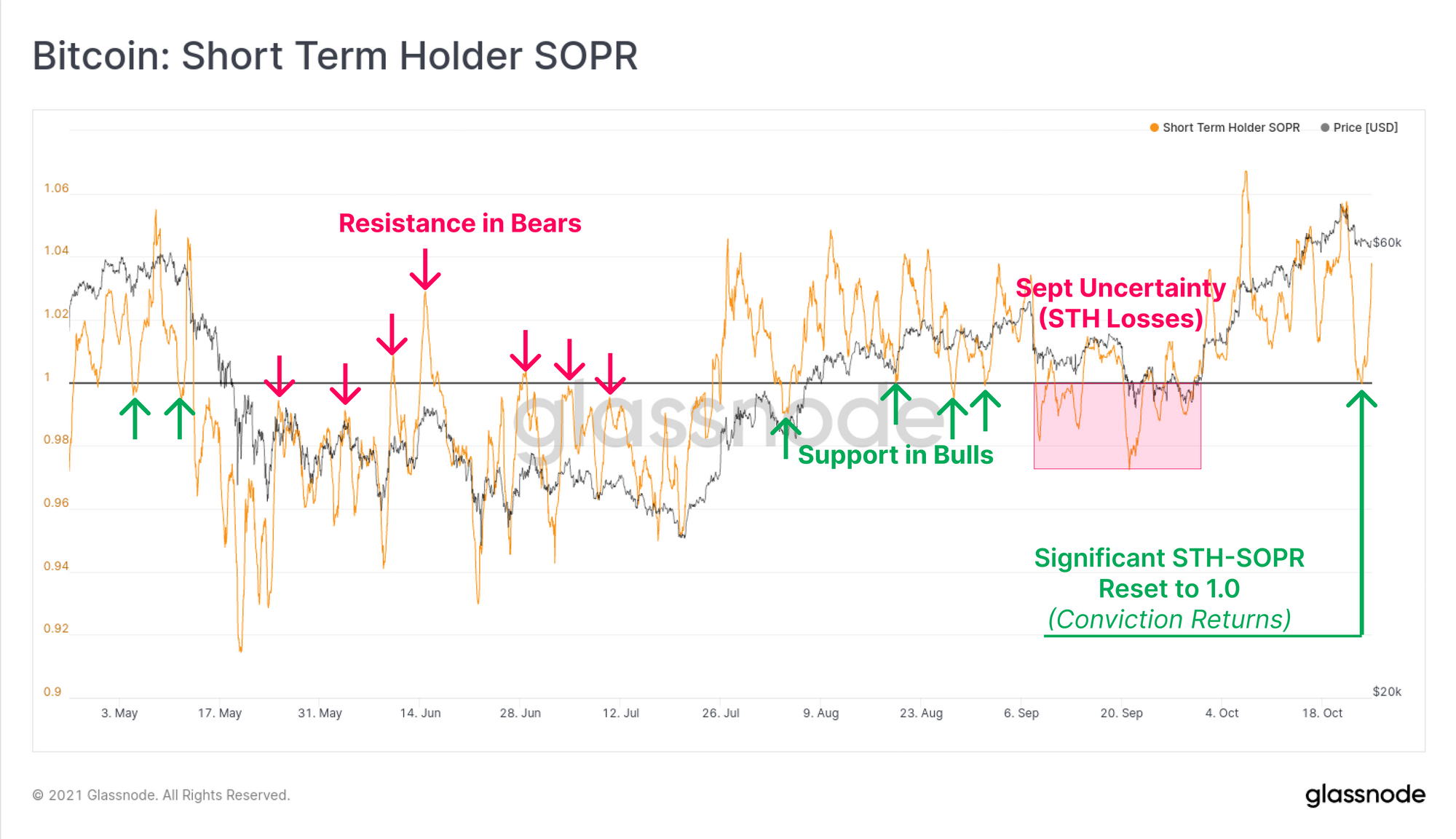
The Short-Term Holder SOPR metric has also signalled a return of conviction, with a reset back to a value of 1.0. SOPR reflects the aggregate profitability of coins spent that day, with values greater than 1.0 signalling net profits, and less than 1.0 net losses.
STHs tend to be the marginal buyers and sellers, and STH-SOPR often signals support (in bull) and resistance (in bears) when it resets back to a value of 1.0. This indicates that both profitable, and loss holding coins remain dormant and signifies a return of conviction. In a bull market, SOPR resets offers a reasonable case for the lows of a correction, even if only for a shorter term bounce.
Overall, a handful of Long-Term Holders have started spending their coins to realise profits and is showing up in elevated destroyed lifespan metrics. However, the uplift in Dormancy and Binary CDD remain fairly small relative to prior bull cycle distributions, and even STHs have stopped spending during this correction. With LTH supply already starting to recover, the most likely interpretation is that the vast majority of coin holders are still expecting and waiting for higher prices.
Weekly Feature: Community Workbench Charts
We are pleased to have released a suite of pre-set charts to Workbench that are constructed and shared by our community of analysts.
The first is the Top Cap model which was invested by the grandfather of on-chain analytics himself, @woonomic. This model applies a multiple of 35 to the all-time average price of Bitcoin to establish a cycle top model which has picked all four prior macro market tops.
Live Chart
The second is the Illiquid Supply Shock (ISS) Ratio proposed by @WClementeIII. Where coins are primarily flowing out of liquid circulation, the ISS Ratio will trend higher suggesting increased probability of a supply shock. Conversely, downtrends in ISS Ratio will occur as illiquid coins are spent back into liquid circulation, reducing the probability of a supply shock.
Live Chart
The Realised Price to Liveliness Ratio (RPLR) was introduced by @dorinvesting, which modifies the Realised Price using Liveliness. By taking the ratio between the two, a 'fair value' model for Bitcoin can be established that accounts for periods of time where HODLing, or spending dominates investor behaviour.
- Where more HODLing is taking place, more coin-days are created, Liveliness trends towards zero, and RPLR fair value is estimated higher.
- Where less HODLing is taking place, more coin-days are destroyed, Liveliness trends towards unity, and RPLR fair value is estimated lower.
Live Chart
Lastly, we have the Bitcoin Price Temperature, crafted by @dilutionproof and is used to establish a mean reversion model based on the cyclical nature of Bitcoin investment and halving cycles. It provides both an oscillator, and pricing bands for assessing which price levels coincide with fair-value, or extreme outlier standard deviation multiples.
Live Chart