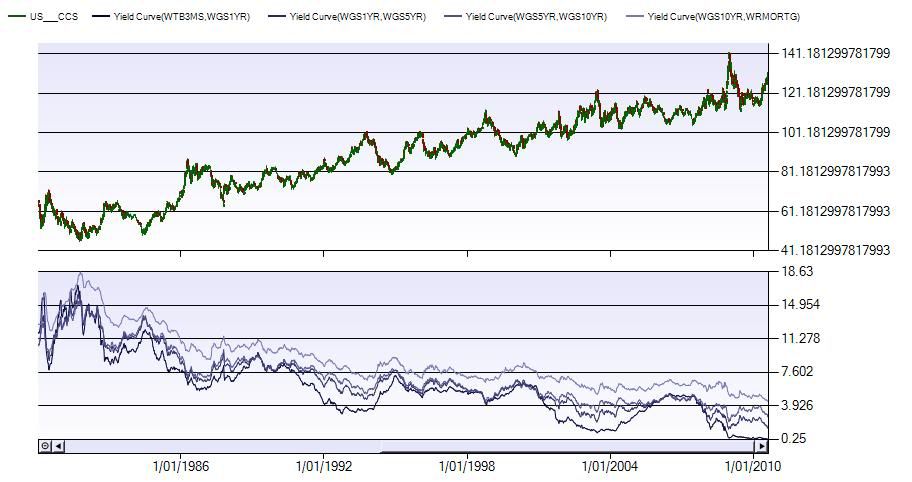
We can look at the yield curves to get a bit of an idea why bonds are rallying.
Here is a chart of the yield curve back to 1980, which was a long term peak year in yield spreads. The darker (bottom) line is the shorter term spread (3 Month to 1 Year) and the lighter (top) line is the longer term (10yr vs 30yr).

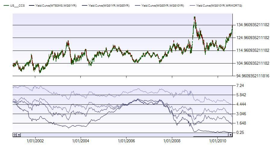
And closer in on recent history

So there are 4 things that strike me as being significant here.
Firstly, the bullish trend throughout the entire period.
Second, the inverse relationship between bond prices, and yield spreads.
Thirdly, the recent action shows that the short term yields are basically at zero, so now the longer term yields are moving down with the bond rally.
Finally, it is also useful to notice that whenever the short term spread (bottom curve) pushes up to, and even overtakes the middle two curves, the equities market tends to trend quite strongly like 2005 to mid 2007.
So, will we see a further flattening out of the curve? Is this predicting the double dip recession many have been jabbering on about?
- Forums
- ASX - By Stock
- bond market bubble?
We can look at the yield curves to get a bit of an idea why...
Featured News
Add XJO (ASX) to my watchlist
 (20min delay) (20min delay)
|
|||||
|
Last
8,255.6 |
Change
-10.600(0.13%) |
Mkt cap ! n/a | |||
| Open | High | Low |
| 8,266.2 | 8,266.2 | 8,215.8 |
Featured News
| XJO (ASX) Chart |
The Watchlist
NUZ
NEURIZON THERAPEUTICS LIMITED
Michael Thurn, CEO & MD
Michael Thurn
CEO & MD
SPONSORED BY The Market Online


