That chart is showing that the bubble has reached its peak and has already burst in most states. Tas looks like its still building and Vic is coming down .
WA looks like its actually getting closer to its long term average.
That chart is showing that the bubble has reached its peak and...
-
- There are more pages in this discussion • 2 more messages in this thread...


You’re viewing a single post only. To view the entire thread just sign in or Join Now (FREE)
Featured News
Featured News
LU7
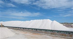
Discover the strong preliminary feasibility of the Bécancour Lithium Refinery, showcasing resilience in a low pricing environment and a strategic plan to capitalize on future price recoveries
NEWS
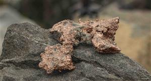
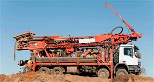
Antler Copper Project hits major permitting milestone – air quality permit advances to final review