Thanks for the charts, but I'm not sure what you're trying to show?
Few things:
1) CLZ is not a gold producer, so you're not comparing apples with apples. CLZ might like to market that they're almost a gold producer, but they aren't.
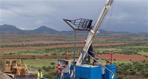
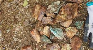
2) You'd be better off comparing to other speccies/juniors in the exploration space. But then you'd also need to take into consideration their drill results, JORC (if they have one), tenements, approvals, infrastructure, etc. Comparing CLZ with companies like S32 is weird, they're in completely different ballgames. The current price of S32 is 3,365x higher than that of CLZ.
3) Charts with no context and really weird scales (overlaying a 0.001 bid spread on top of a %-change) really doesn't provide a lot of statistical value, or significant value.
Can you provide some commentary around the charts and what they're trying to represent if possible please? I'm otherwise kinda just confused.


Add to My Watchlist
What is My Watchlist?
 (20min delay) (20min delay)
|
|||||
|
Last
0.1¢ |
Change
0.000(0.00%) |
Mkt cap ! $3.017M | |||
| Open | High | Low | Value | Volume |
| 0.0¢ | 0.0¢ | 0.0¢ | $0 | 0 |
| CLZ (ASX) Chart |
Day chart unavailable