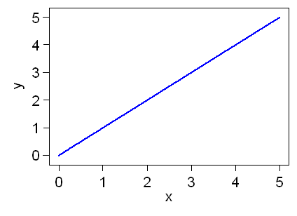
There's a thing with hot copper, it's funny, the less revenue and profit the company makes, the more it's discussed. See this demonstration graph I made:
The Y Axis being how many millions of dollars they are losing, or easily substituted for how many issues the company has.
X axis represents the level of discussion on hot copper relevant to that stock. As you can see in my highly informative and technical graph, there is a direct correlation between these.
Disclaimer: All views represented in this post are those of the author and are 100% accurate.
Hello??, page-9
-
-
- There are more pages in this discussion • 9 more messages in this thread...


You’re viewing a single post only. To view the entire thread just sign in or Join Now (FREE)