
It's been a rough week for the Australian Stock Market, XJO down heavily -1.71%. That's the worst weekly result since mid March. Only three out of eleven sectors were up. The best, by a long way, was Information Technology (XIJ +4.73%)
OK, let's get into the details.
XJO Daily Chart.
Triple Supertrend Lines are giving "sell" signals (all blue).
The chart isn't all negative despite the Supertrend Lines. The chart is close to support of the 200-Day MA, and the low of 5 April. It is also right on the support of the Ichimoku Base line which is running horizontal from 27 March to 14 April. MACD Histogram is also showing a marked positive divergence to the XJO Chart.
The XJO on Friday had a narrow range day inside the wide range of Thursday. If a big up day occurs from here, the XJO will have a significant three-day reversal pattern. Given that Ozzie Futures are currently at +0.99%, that sounds like a done deal.
XJO, as often happens, is lagging well behind the American market where the Nasdaq has been going gang-busters. Unfortunately, Australia has a small tech sector (but see XIJ above) so that is the reason we often lag behind the U.S. If our resources show strength, however, out market often plays catch-up.
American SP500.
The SP500 chart is bullish. The Triple Supertrend Lines are bullish (all yellow). The chart is well above the 50-Day MA (blue curved line) which is curving to the up-side.
MACD Histogram is above its zero line - that's bullish.
The chart is now at horizontal resistance. A break higher would be very bullish as that would be a new 52-Week high.
The American market is closed on Monday so we might have to wait until Wednesday morning Oz time to see if the U.S. breaks to the upside.
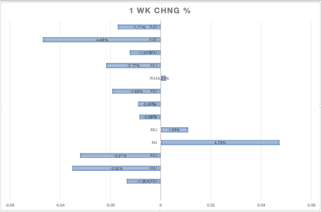
Sector Performance this past week.
In this bar chart, we can see the out-performance of Information Technology (+4.73%. Only two other sectors were positive, Energy (XEJ +1.09%) and Utilities (XUJ +0.21%).
The worst performing sector was Materials (XMJ -3.52%). We could see a rebound in that sector on Monday as both BHP and Rio were up ~3% on Friday night in the U.S.
The next worst sector was Discretionary (XDJ -3.21). That's clearly a result of the belt-tightening which has occurred by the RBA's recent raising of interest rates to an eleven year high. Pundits (e.g. CBA) are expecting a pause in interest rate rises in May - economists are suggesting about a 90% certainty that no interest rate rise will occur at the next RBA meeting on June 6. That might take the pressure off XDJ just a little.
Gold Miners, which is a sub-set of Materials, has been taking a beating lately, but on a one year basis is a good performer. GDX (Gold Miners ETF) is one of those stocks worth trading if you can handle the necessary technical analysis. Here's the GDX chart:When the Supertrend Lines are all yellow and the chart is above the Ichimoku Base Line, we have a "buy" signal back in mid-March. Traders were well prepped by a move off the 200-Day MA and a big positive divergence on the CCI.
In mid-May, GDX gave a "sell" signal with the Supertrend Lines all blue and the chart breaking below the Ichimoku Base Line. That occurred on 12 May.
The chart is now prepping traders for a reversal to the upside, with a positive divergence on CCI and MACD Histogram.
That's not a "buy" signal - just a "get ready" signal.
Personally, I'd wait for a Triple Supertrend Buy Signal (all yellow) and a break back above the Ichimoku Base Line. Keep watching and waiting. This could, of course, keep heading down for some time yet.
Sector Momentum.
A quick way to check momentum is to compare the daily RSI with weekly RSI. If daily RSI is below weekly RSI, then momentum is negative, or bearish. Vice versa, if daily RSI is above weekly RSI, then momentum is positive or bullish.Three sectors are showing positive momentum (bullish). Information Technology (XIJ), Energy (XEJ) and Financials (XXJ).
Positive momentum in XIJ and XEJ is no surprise, but XXJ looks like one out of the box.
Unfortunately, not all Stocks in XXJ are created equal. There is a big difference between some of the insurers and the big banks. Consider the following:
IAG
SUN
NAB
WESTPAC
There is a clear difference between IAG/SUN and NAB/WBC.
It's not all bad news for the Banks. The above two bank charts may be prepping investors for a move to the upside as some positive divergences are showing up on indicators. Watch.
New Highs and New Lows
NewHighs-NewLows sometimes gives advance warning of changes in the market when the chart is at extremes.
12-17 April showed a negative divergence and the XJO commenced a fall on 18 April.
NH-NL is now showing a positive divergence - so it is prepping us for a move to the upside. No guarantees - watch.
Conclusion.
The Australian market had a poor week, but appears to be setting up for an upside move. No Guarantees but watch and act if we see definite moves to the upside.
It's been a rough week for the Australian Stock Market, XJO...


Add XJO (ASX) to my watchlist
 (20min delay) (20min delay)
|
|||||
|
Last
8,212.2 |
Change
8.500(0.10%) |
Mkt cap ! n/a | |||
| Open | High | Low |
| 8,203.7 | 8,225.5 | 8,203.7 |
| XJO (ASX) Chart |