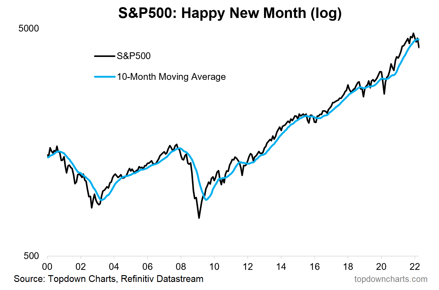
1. Happy(?) New Month! Another month, another update to the monthly chart, now tracking clean an clear below its 10-month moving average.
Source: @topdowncharts
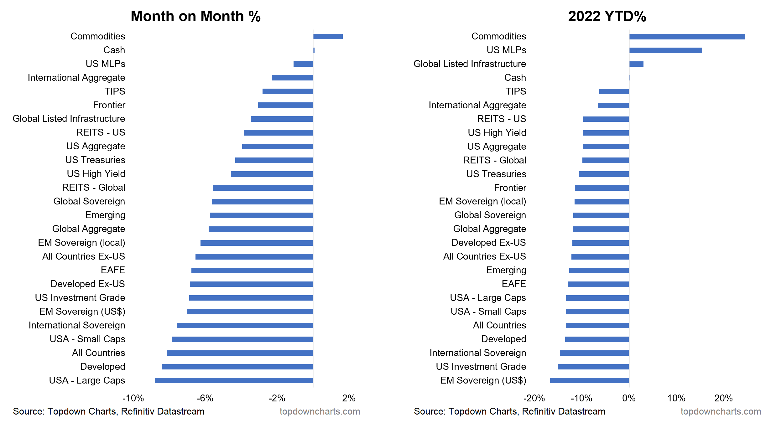
2. Monthly Asset Returns: US Large Cap equities were at the bottom of the table in April… basically everything except cash & commodities was in the crapper this month.
Source: Asset Class Returns
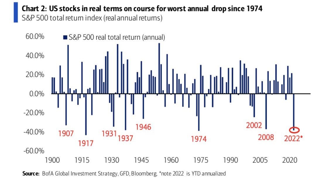
3. S&P500 Real Returns: CPI-Adjusted S&P500 on track for its worst performance since 1974 (and if you wanted a macro analog, the 70's have some similarities... e.g. surging inflation, geopolitical shocks, surging rates).
Source: @Marlin_Capital
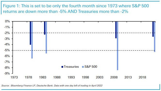
4. Rare Returns: As highlighted in chart 2, both stocks and bonds have had a rough and tough time this year. It was always going to be a hard ask for bonds to be a diversifier to stocks when both were extreme expensive -- all was needed was an inflation shock.
Source: @DiMartinoBooth
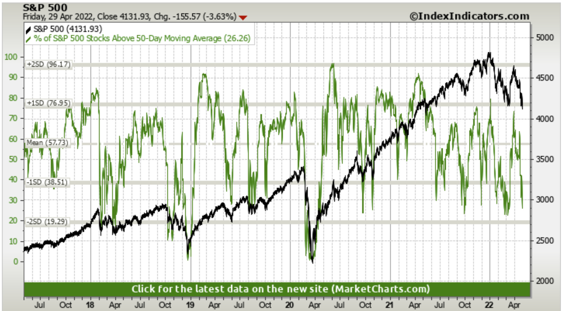
5. Bad Breadth Update: An update to that 50dma breadth chart from last week: starting to look a little more oversold this week... but I would probably still just call it strong bearish momentum as the index has also taken out a pretty key level.
Source: @MarketCharts
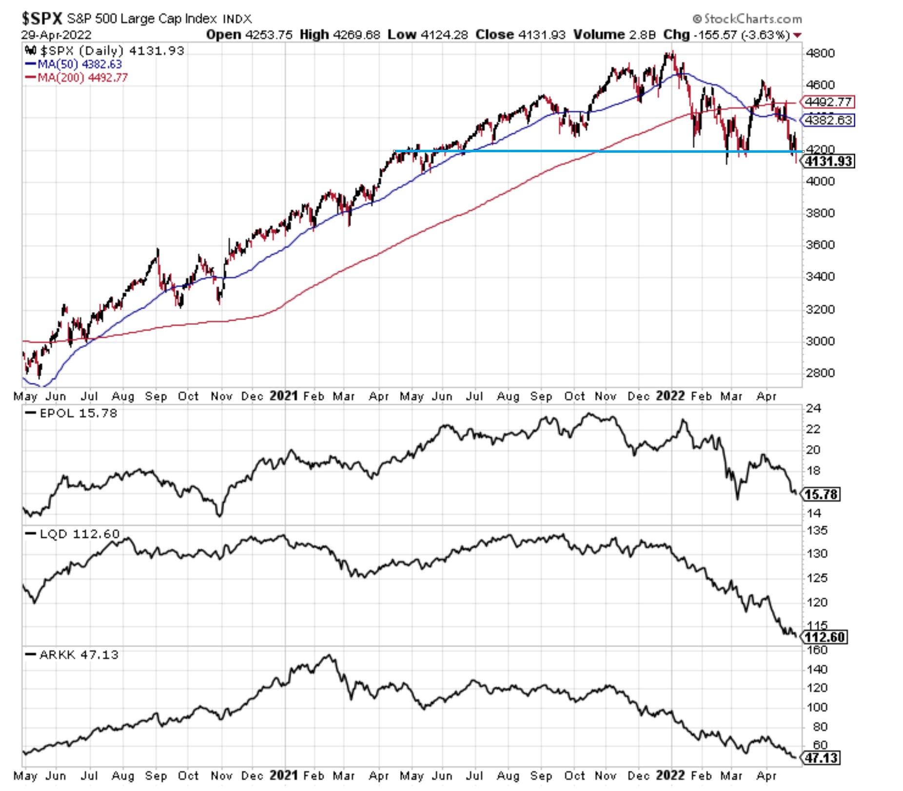
6. Correction-Drivers Update:
-EPOL [Poland ETF] (geopolitics proxy): worsening, high risk of spillovers.
-LQD [IG Credit ETF] (credit/rates): new lows as bond yields spike further + credit risk sentiment is starting to stumble too as the macro outlook dims.
-ARKK [New Tech Fund] (tech burst): new lows as tech reset plays through.
And the index has made an initial break down. Not good.
Source: @Callum_Thomas
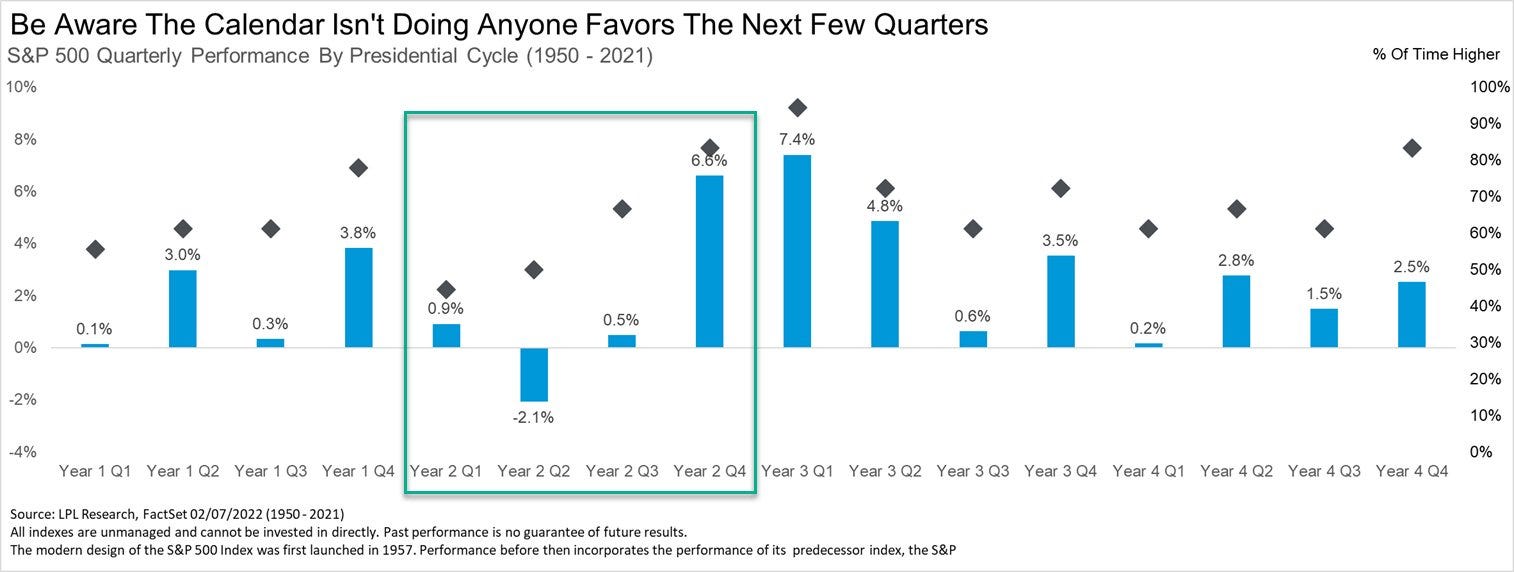
7. "SELL IN MAY" (especially May of Mid-Term years)
(of course: past performance - while informative and interesting context - is no guarantee of future results)
Source: @RyanDetrick
8. Let There be no Ambiguity: This is a bear market.
Under the surface the picture is clear as demonstrated in this excellent chart. We are only now starting to see the index roll over in earnest.
Source: @jasongoepfert
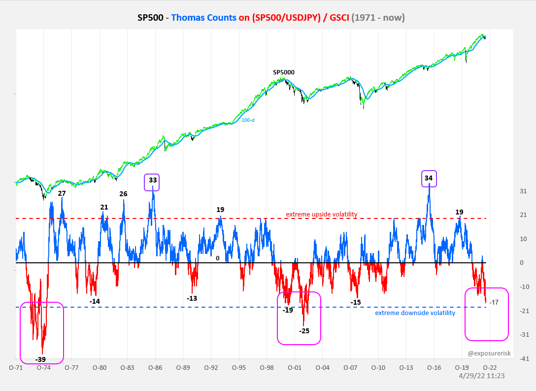
9. History Rhymes: Without even delving into the specifics of this chart the thing that is crystal clear is how many parallels there are NOW versus BOTH 2000 (tech boom/bust) AND 1970's (inflation/geopolitical shocks).
Source: @exposurerisk
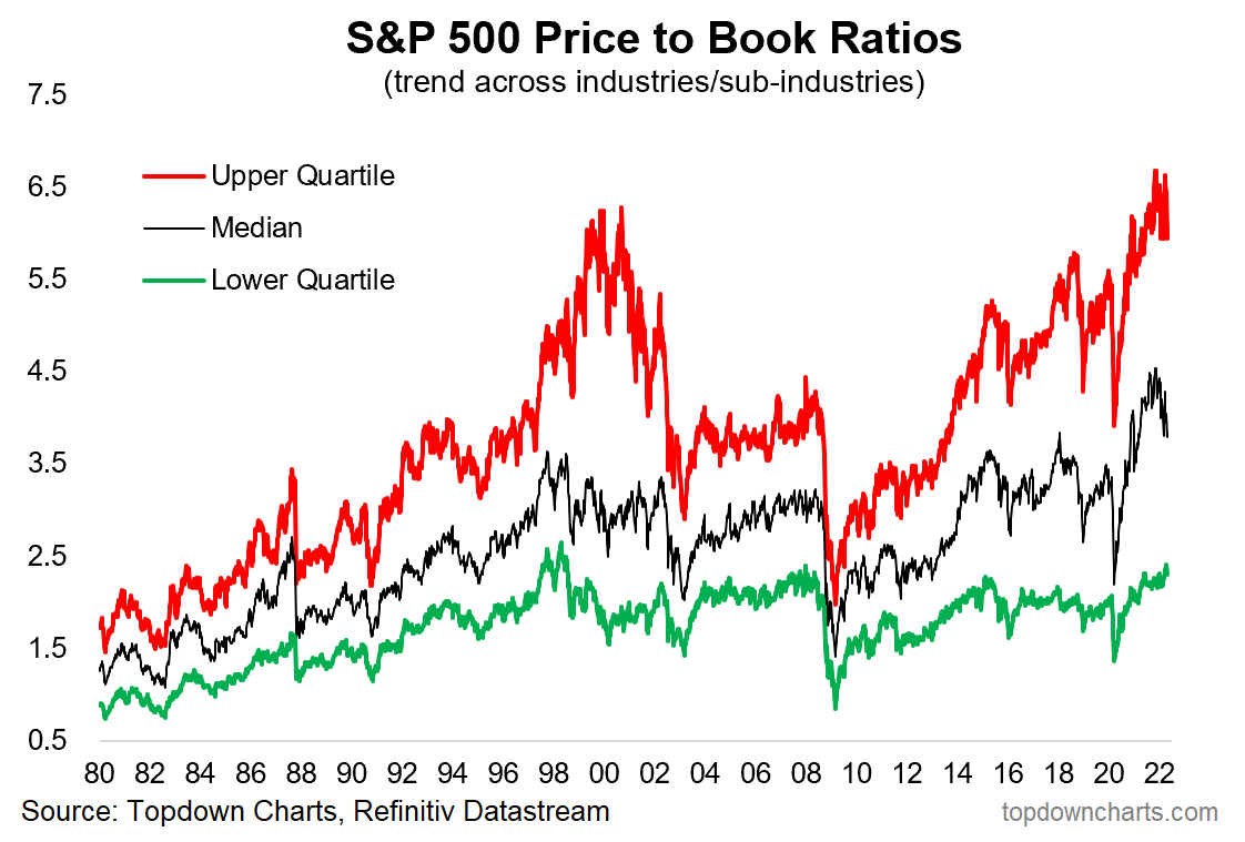
10. Valuations: I know not everyone likes the Price-to-Book ratio, and fewer still like comparing valuations across time, and people will offer plenty of explanations/reasons for why it’s so high...
But sh*t still expensive.
Source: Vertiginous Valuations
Its Over, page-12513
-
- There are more pages in this discussion • 11,045 more messages in this thread...


You’re viewing a single post only. To view the entire thread just sign in or Join Now (FREE)