‘‘History doesn’t repeat itself, but it often rhymes.’’
Mark Twain
The Macro Compass
Looking at historical parallels to assess prevailing macro conditions can be a useful exercise - also in markets, one can argue that in the end history doesn’t perfectly repeat itself but if often rhymes.
In December 2021, carrying a similar analysis I found out that 2022 had a high potential of being ‘‘2018 on steroids’’ and hence delivering negative returns across asset classes: what about today?
Refreshing my macro framework and digging into 50+ years of history, the evidence is pretty compelling: the next 6 months might well resemble the Q4 2000 - Q1 2001 period.
Leading to that period, we experienced excessive animal spirits and risk-taking activities mostly exemplified by the Dot-Com bubble.
In late 2000 and early 2001, as financial conditions became tighter we instead experienced a marked slowdown in earnings and weakness in the labor market but inflation remained stubbornly above 2% hence delaying and limiting the Fed’s ability to accommodate.
Sounds familiar, right?
In this piece, we will:
- Update The Macro Compass framework, exploring the latest development in forward-looking macro indicators and gauges of monetary policy stance;
- Discuss the parallels with Q4 2000 - Q1 2001, and have a look at the performance of several asset classes during this period to learn some lessons about how to position our portfolios today.
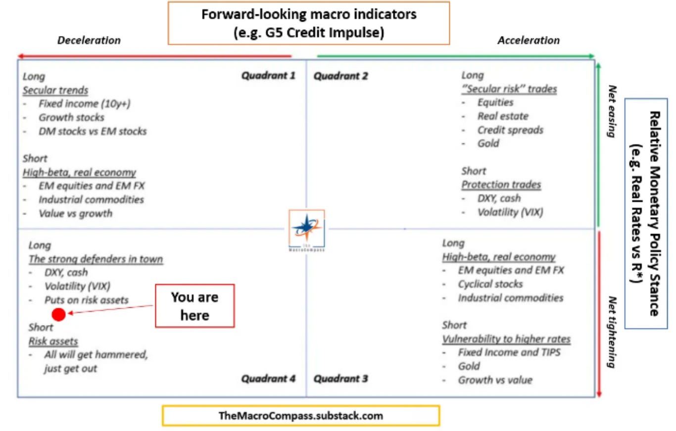
Refreshing The Macro Framework
The Macro Compass framework revolves around forward-looking macro indicators and gauges of the relative monetary policy stance to assess where we stand in the economic cycle and hence what the most appropriate asset allocation could be.
While my analysis keeps firmly pointing towards Quadrant 4, quite a lot of things are brewing under the surface.
To reflect upon those, let’s refresh some of my main indicators.
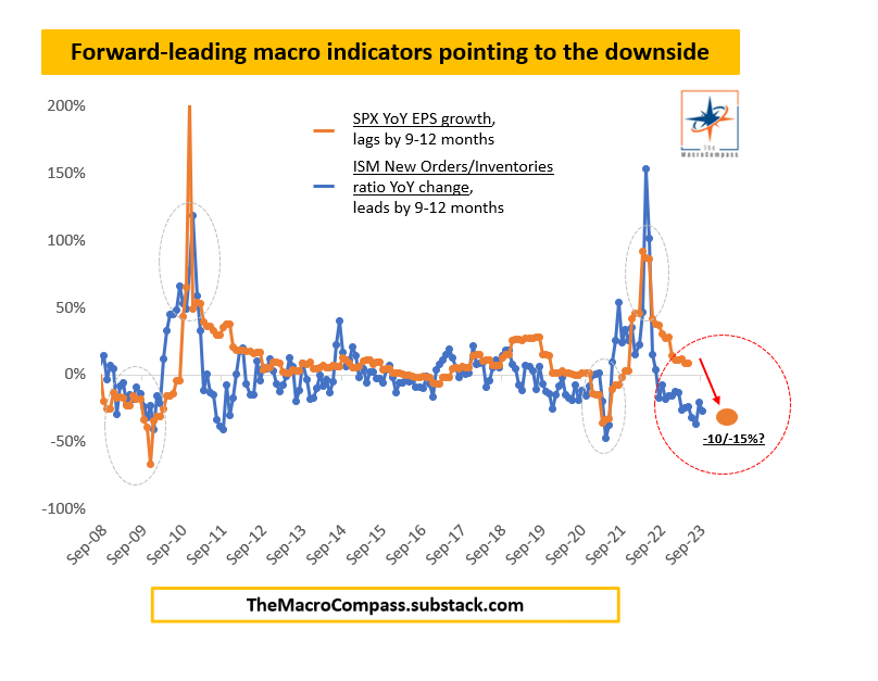
1. Forward-Looking Macro Indicators Are Pointing DOWN
The x-axis of the TMC Quadrant model informs us on the rate of change in economic growth: will economic activity be accelerating or decelerating?
Statistically significant forward-looking macro indicators are very useful to get an idea of what’s ahead for the global economy.
Let’s focus on two of these.
The chart below shows the YoY changes in US ISM New Orders/Inventories ratio (blue) against YoY changes in S&P500 EPS growth (orange, lagged by 3-4 quarters).
If companies are reporting a sluggish pace of new orders and at the same time quickly building up large inventories, a few quarters later earnings growth is likely to start disappointing.
Notice how this forward-looking macro indicator does particularly well at predicting turning points in EPS growth, and it’s now pointing towards negative earnings growth in 2023.
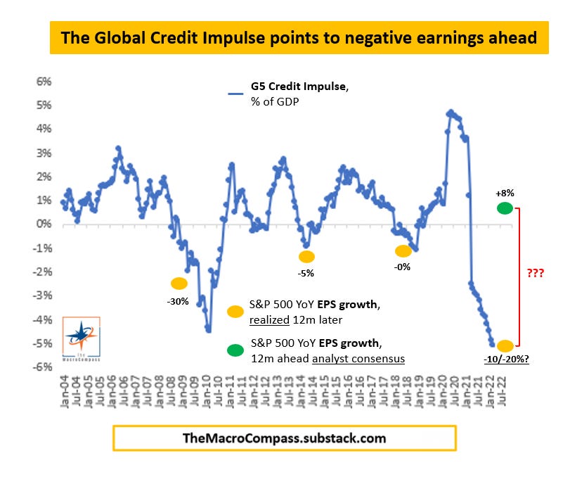
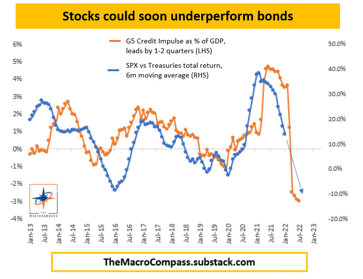
A robust framework doesn’t rely on a single indicator, so let’s refresh whether my flagship Global Credit Impulse metric suggests a similar slowdown ahead for nominal growth (here proxied with YoY S&P 500 earnings growth).
This indicator measures the rate of change of money creation for the real economy (mostly the non-financial private sector = households and corporates).
Think about it: the faster your bank deposits (i.e. real-economy money) grow, the more likely you are to increase nominal spending and boost economic activity.
And vice versa.
In July 2022 (latest available data), the G5 Credit Impulse printed at 20y lows as the result of the combination of a gigantic post C-19 fiscal drag + Chinese de-leveraging + insufficient pickup in global bank lending.
While analysts expect earnings to grow by 8% in 2023 (green dot), such a drop in the Global Credit Impulse is instead consistent with an EPS contraction well in the double-digit area.
The message seems consistent: going forward earnings are likely to disappoint.
And disappoint very hard.
In late 2000/early 2001, economic growth and earnings were on the verge of a serious slowdown: check.
Leave a comment
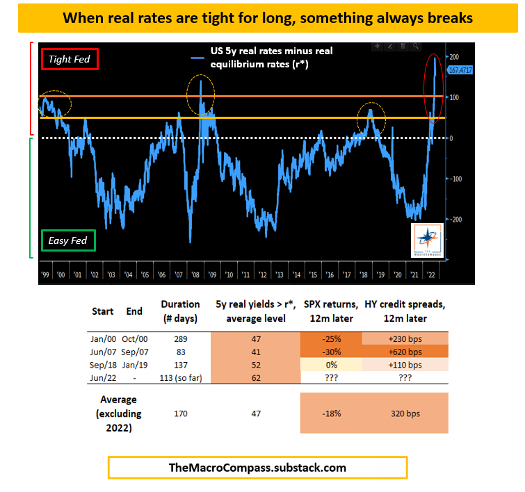
2. The Relative Monetary Policy Stance Remains VERY TIGHT
The y-axis of the TMC Quadrant model instead captures the relative monetary policy stance - while many investors judge the Fed to be tight or loose based on the absolute level of Fed Funds, my framework suggests the pace of change in monetary policy and the Central Bank’s stance relative to equilibrium (r*) are much more important for economic growth and the performance of asset classes.
In other words considering the much weaker demographics, sluggish labor supply growth and larger amounts of unproductive leverage…today’s equilibrium rates are much lower than 20 or 30 years ago, and hence a 5% risk-free rate today is much tighter than in the ‘90s - it’s all relative.
The sharp pivot from an accommodative stance and forward guidance in Oct-21 to a restrictive approach in H1 2022 was truly impressive, but most investors haven’t still realized how tight and for how long Central Banks will be against estimates of neutral real rates (r*).
Right now, US 5y real yields are trading >150 bps above neutral: wow!
Some observations about this very tight stance from the table above:
- Every time the Fed kept real rates ~50+ bps above equilibrium for longer than a few months, something broke (2000, 2007, 2018, 2022-2023…
;
- After such a restrictive policy is enforced, 12m forward returns in the S&P500 are generally very negative and high-yield credit spreads are much wider; the exception being 2019, when the Fed’s massive pivot limited losses somehow;
- In 2022, we have now been tight for 113 days already and the latest levels of real yields are really, really high relative to equilibrium: ouch.
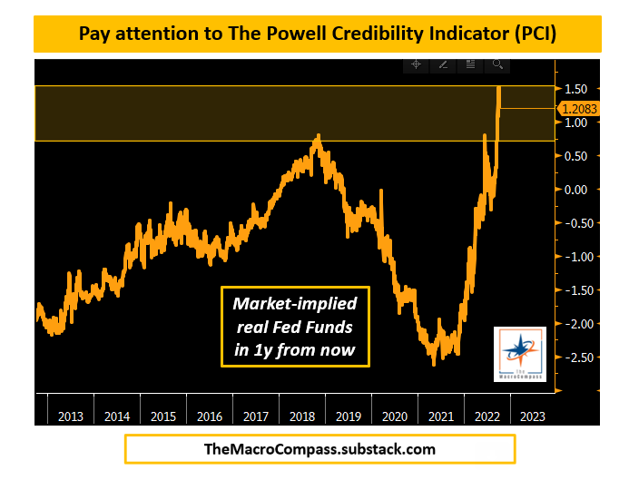
The reason why the Fed’s stance is so tight is credibility.
The Fed has been so wrong for so long and their price stability mandate is far from their reach, and hence Powell’s credibility is seriously at stake.
But J-Pow knows this, and his Jackson Hole speech was unambiguously clear: the Fed will be as tight as needed until the job (inflation back at 2%) is done.
And Powell can’t let markets challenge his credibility further.
This is why I built the Powell Credibility Indicator (PCI): it measures the market-implied real Fed Funds in one year from now.
Given how bad the inflation setup is, to preserve his credibility Powell needs to convince markets that real Fed Funds will sit in the +1% area (very tight).
So far so good for Powell’s attempt to restore his credibility with markets.
But this means that the Fed’s relative monetary policy stance will have to remain tight for longer.
In late 2000/early 2001, Fed Funds were at 6.50% (50+ bps above my estimates of neutral rate) and as inflation was in the 4% area for many quarters in a row the Fed was hesitant in cutting rates even as the economy was rolling over: check.
Let’s now discuss a bit further the similarities with the Q42000-Q12001 period and how asset classes performed back then.
Early 2001 Is Here, Again!
The Macro Compass framework calls for a period of slowing real growth, possibly peaking inflationary pressures but still a tight monetary policy stance ahead.
When looking for historical parallels though, controlling for the above variables isn’t enough - we also need to think about a period when inflation was running above Central Banks’ targets for long, the labor market was showing the first preliminary signs of weakness and animal spirits had generated excess risk taking in certain corners of the market.
The Q4 2000 - Q1 2001 period serves as a very compelling historical parallel, because:
So, how did asset classes perform in that period?
- The Dot-Com bubble had generated excessive risk taking in markets (2021: ARKK, Bitcoin, etc.);
- CPI had rapidly increased from sub-2% in mid-1999 to 3.8% in Q1-2000, and inflation remained close to 4% for many months to come;
- As a result, the Fed had to hike rates by 200 bps in a few quarters, send Fed Funds markedly above neutral and keep them there for at least 1 year - moreover, the hurdle to cut rates was very high (deja vu?);
- Forward-looking macro indicators showed signs of stress in 2000, and by the end of the year the labor market was weakening and EPS growth were flatlining (similar to today).
The key takeaway is that equities kept selling off while bonds did well.
Looking under the surface, the other interesting observations are that bond-proxy and defensive equity sectors (e.g. utilities, but also consumer staples) actually delivered positive returns and that even as the Fed started cutting rates the USD didn’t immediately depreciate.
The most important message here is that contrary to popular belief the initial weakness in the labor market and in earnings is NOT bullish risk assets - as risk sentiment deteriorates, growth gets repriced down and as Central Banks can barely move back to neutral (maybe)…risk assets can’t rally, but actually continue to suffer.
In my opinion, the best portfolio expression of such a macro environment is a relative trade: overweight bonds vis-à-vis an underweight in (cyclical) equities.
I expect bonds to overperform stocks by at least 10% over the next quarters.
Accordingly, my Long-Term ETF portfolio (constructed to deliver better risk-adjusted return vs a 60-40 benchmark portfolio) remains positioned as follows:
- Long (USD) Cash;
- Large Underweight in Equities and all other risk assets;
- Patiently accumulating 10y+ Bonds (last and only purchases on June 23, so far).
To sum it all up: a refresh of my macro framework points to eerie similarities with the early 2001 period, which saw major cracks appearing in the labor market and earnings and hence further sell-off in equities.
The ‘‘good’’ news is that a long-only investor could at least find some shelter in bonds and bond proxies.
Its Over, page-14877
-
- There are more pages in this discussion • 7,781 more messages in this thread...


You’re viewing a single post only. To view the entire thread just sign in or Join Now (FREE)