The charts that tells us that there is yet any semblance of order in the markets....
Broken Markets: A Visual Odyssey Through All The Market's Dislocations In 56 Charts
by Zero Hedge
Wed, 04/01/2020 - 23:45
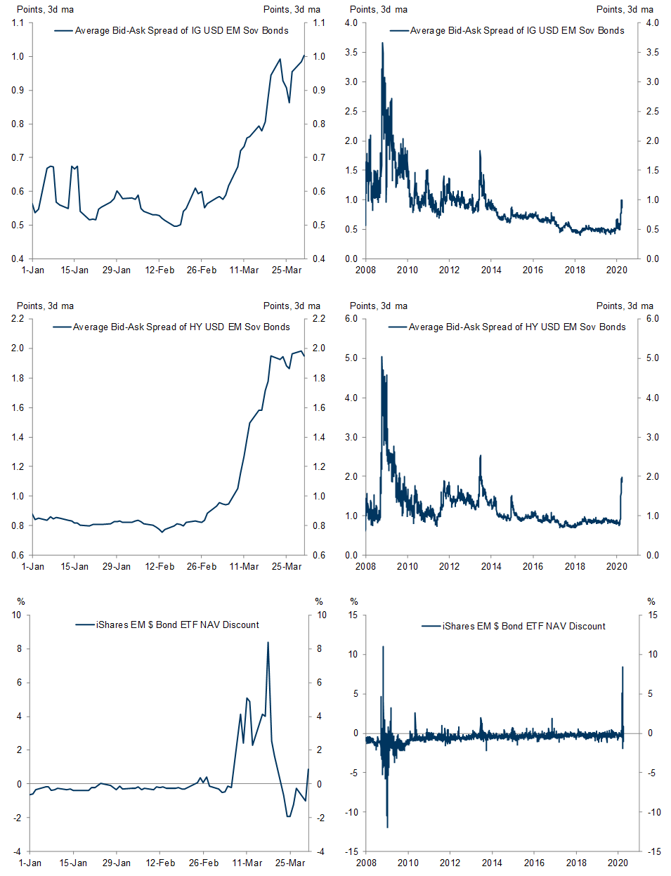
Instead of narrating - often in mind-numbing detail - how broken markets are, for once we will let the charts do the talking. In the visual odyssey through today's broken market, we summarize various measures of market dislocation and stress across asset classes.
Some highlights:
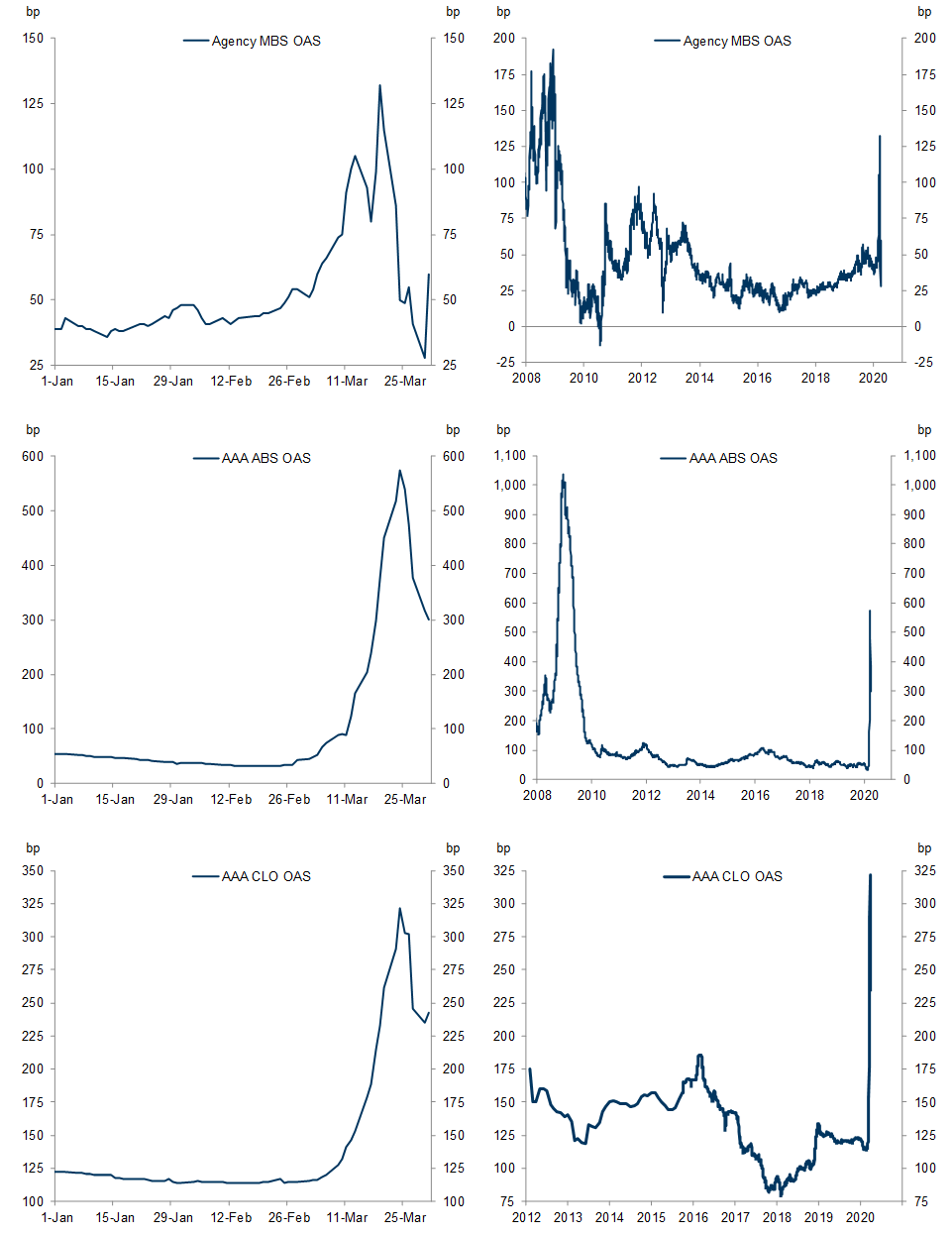
In DM credit markets, the CDX-cash basis in both IG and HY has compressed notably but remain at historical wides. Agency MBS OAS has reversed much of the widening, while CLO and ABS OAS continue to tighten.
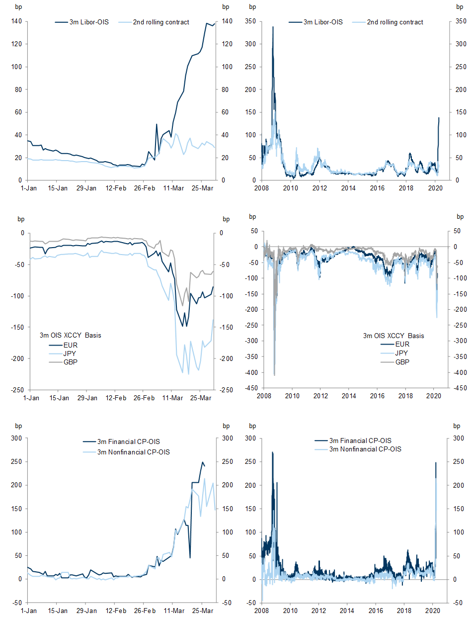
In the rates market, some pressure in front-end funding markets has begun to abate with some of the announced Fed facilities underway, visible in the recent stabilization of cross-currency bases. However, unsecured front-end spreads (such as CP and Libor) on the whole remain at elevated levels.
In emerging markets, while cross-currency bases on average have reversed most of the recent widening, swap spreads remain notably wider.
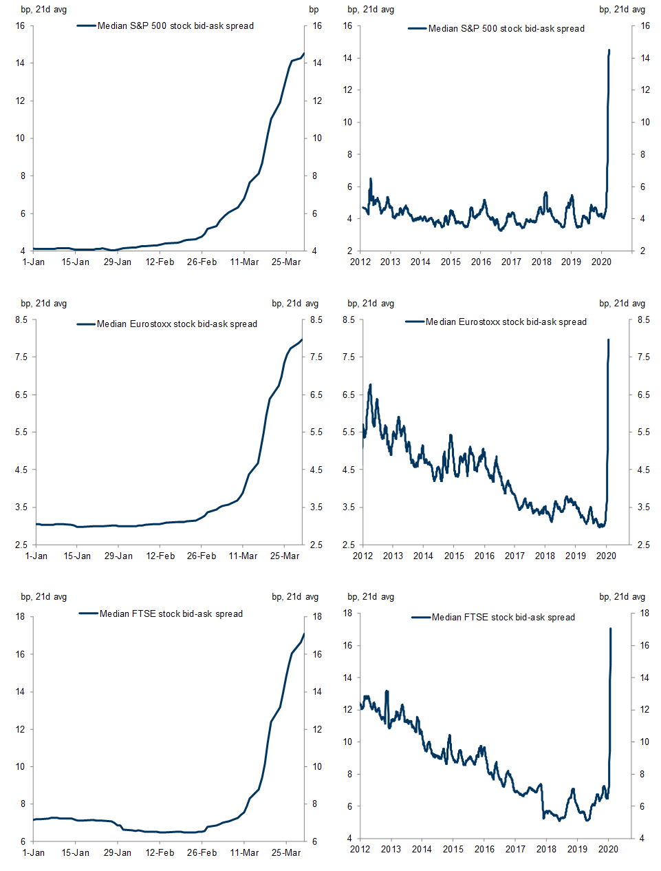
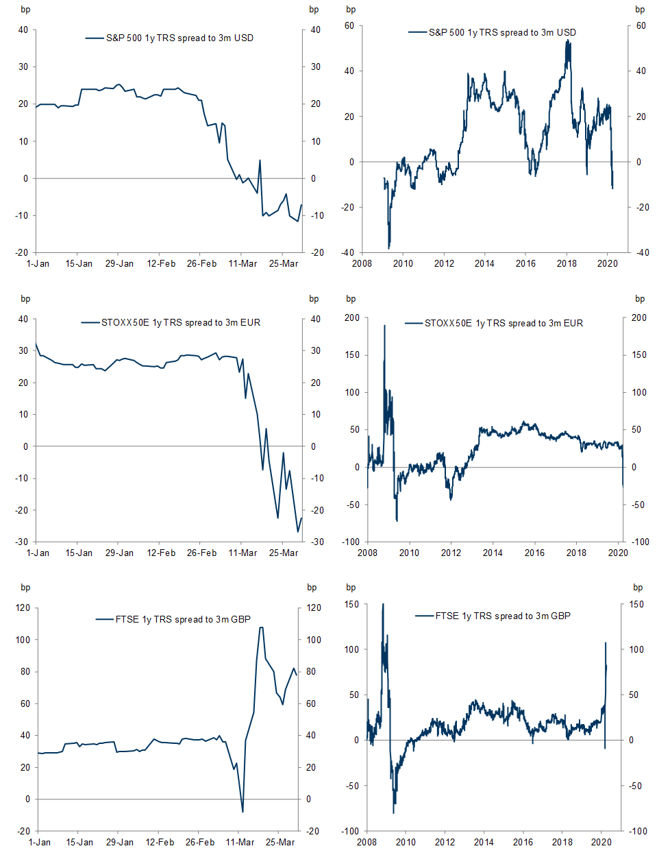
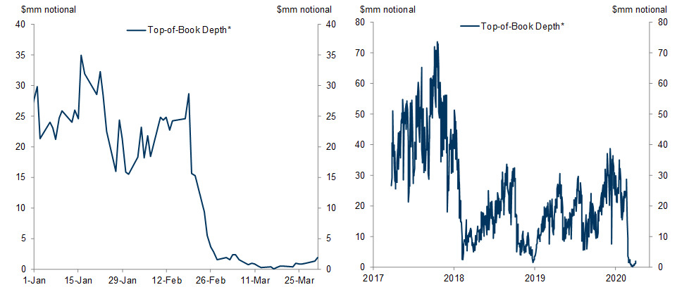
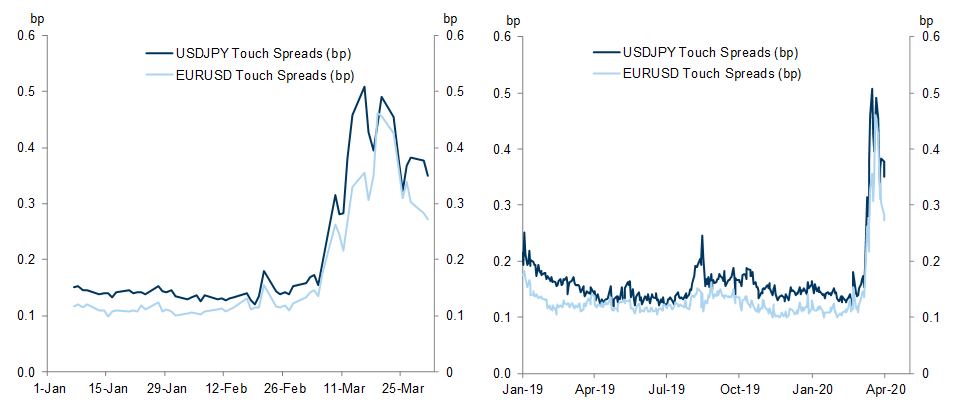
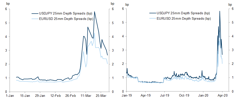
In equity markets, market depth and liquidity remain dismal.
Going down the list, first we show the most notable dislocations and moves in Developed Credit Markets.