I’m not a big believer in trying to predict where the stock market will end each year.
As the old Yogi Berra saying goes: “It's hard to make predictions, especially about the future.”
Further, when I look at the track record of most people, the outcomes tend to be pretty poor.
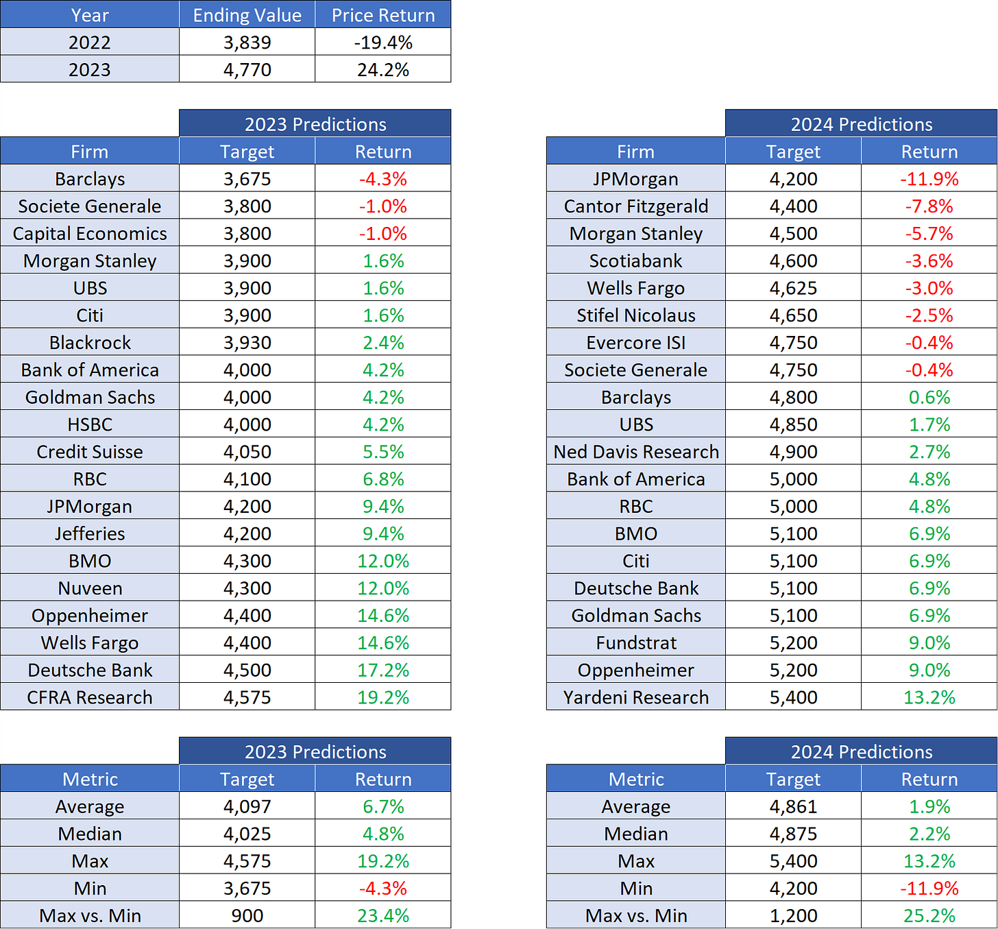
Case in point, see below for the 2023 predictions and what has been predicted for 2024.
A few observations regarding the 2023 predictions:
The average predicted return (+6.7%) was a mere 17.5% short of the actual return for the year. The median predicted return was even worse.
The delta between the maximum and minimum predicted returns was 23.4% or 900 points. You could drive a truck through those bands.
Not one of the “experts” predicted a return higher than +19.2% and yet the market returned +24.2%.
Again, predicting the future is inherently very difficult.
Let’s take a look at the predictions for 2024:
The average predicted return for 2024 (+1.9%) is 4.8% less than the average predicted return for 2023 (+6.7%).
The delta between the maximum and minimum predicted returns for 2024 is 25.2% or 1,200 points. That’s even wider than 2023!
Investopedia notes the following with regard to the average annualized return for the S&P 500: “The average annualized return since its inception in 1928 through Dec. 31, 2022, is 9.81%. The average annualized return since adopting 500 stocks into the index in 1957 through Dec. 31, 2022, is 10.13%.”
Wait a second, I thought everyone was calling for a “soft landing” in 2024 and that risk assets were going “to the moon” again? Yet, the average predicted return for 2024 is +1.9% or less than 20% of the amount we would expect to receive on an “average year”?
Square this with the fact that election years tend to be very good for the stock market.
According to Benzinga: “Over the last 16 presidential election years, the S&P 500 has been up 14 of the full years. The lone two presidential election years in the last 60-plus years that saw the S&P 500 down were the global financial crisis and the dot-com bubble.”
“The average return of the S&P 500 in the presidential election years referenced above is 10.5%. Stripping out the global financial crisis and the dot-com bubble, the S&P 500 gained an average of 15.3%.”
Despite this historical fact, only one 2024 prediction came in above 10.5% and none came in above 15.3%. Aren’t these economists aware of these historical facts?
Again, predicting the future is inherently very difficult.
To combat this, I would like to suggest a different approach. This approach has two key pillars.
First, understand where you are in the longer-term cycle.
Second, understand where you are in the shorter-term trend.
Longer-Term Cycle
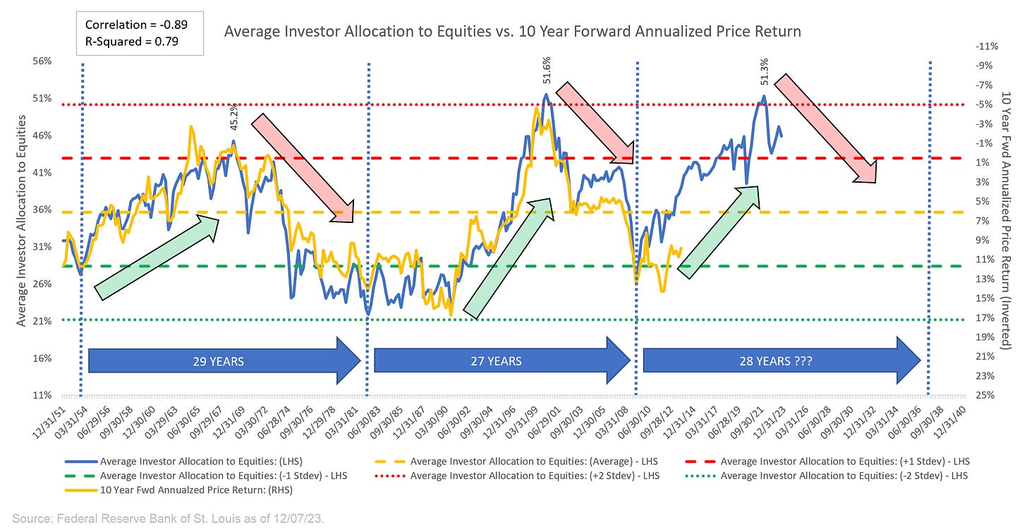
For those who have followed my work for some time now, you know that I’m a big fan of the “Average Investors Allocation to Equities” and more specifically, its ability to forecast S&P 500 returns over the longer term (i.e. 10 years).
Newer readers, please go here for a deeper dive into this concept.
The 50,000-foot version is as follows:
When investors allocate an “abnormally high” amount of their portfolio holdings to US equities, US equities tend to have below-average returns in the period following these “abnormally high” allocations.
Conversely, when investors allocate an “abnormally low” amount of their portfolio holdings to US equities, US equities tend to have above-average returns in the period following these “abnormally low” allocations.
You can see in the chart below that on 12/31/21, the “Average Investors Allocation to Equities” hit a high of 51.3% and has been trending directionally lower since that time.
This figure (51.3%) is more than +2.0 standard deviations greater than the historical average and ironically, it is almost exactly the same value we saw at the last turning point on 03/31/00 at 51.6%.
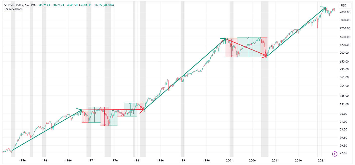
In the following chart, I am showing the monthly prices for the S&P 500.
The green arrows in the chart above correspond to the green arrows in the chart below. The same is true for the red arrows.
The takeaway is that in “green arrow” periods, the S&P 500 tends to have multi-year gains. In “red arrow” periods, the S&P 500 tends to move sideways or lower and typically has one or more recessions associated with the period.
Going back to the point I made earlier, with respect to the longer-term cycle, we need to recognize that we are currently in a “red arrow” period; therefore, our expectation should be that the market will likely move sideways or lower over the next several years until the “Average Allocation to Equities” figure has troughed.
With that said, it doesn’t mean that we can’t experience years with tremendous returns like we did in 2023. Look at the chart above and specifically the large rallies that we saw even while in the “red arrow” periods.
This is where it becomes important to understand the shorter-term trend.
Shorter-Term Trend
It is possible to have a bull market in a secular downtrend just as it is possible to have a bear market in a secular uptrend.
The goal is the understand where you are in the longer-term cycle while at the same time, having the ability to participate in (or avoid) the counter-cyclical moves that the market makes during the longer-term cycles.
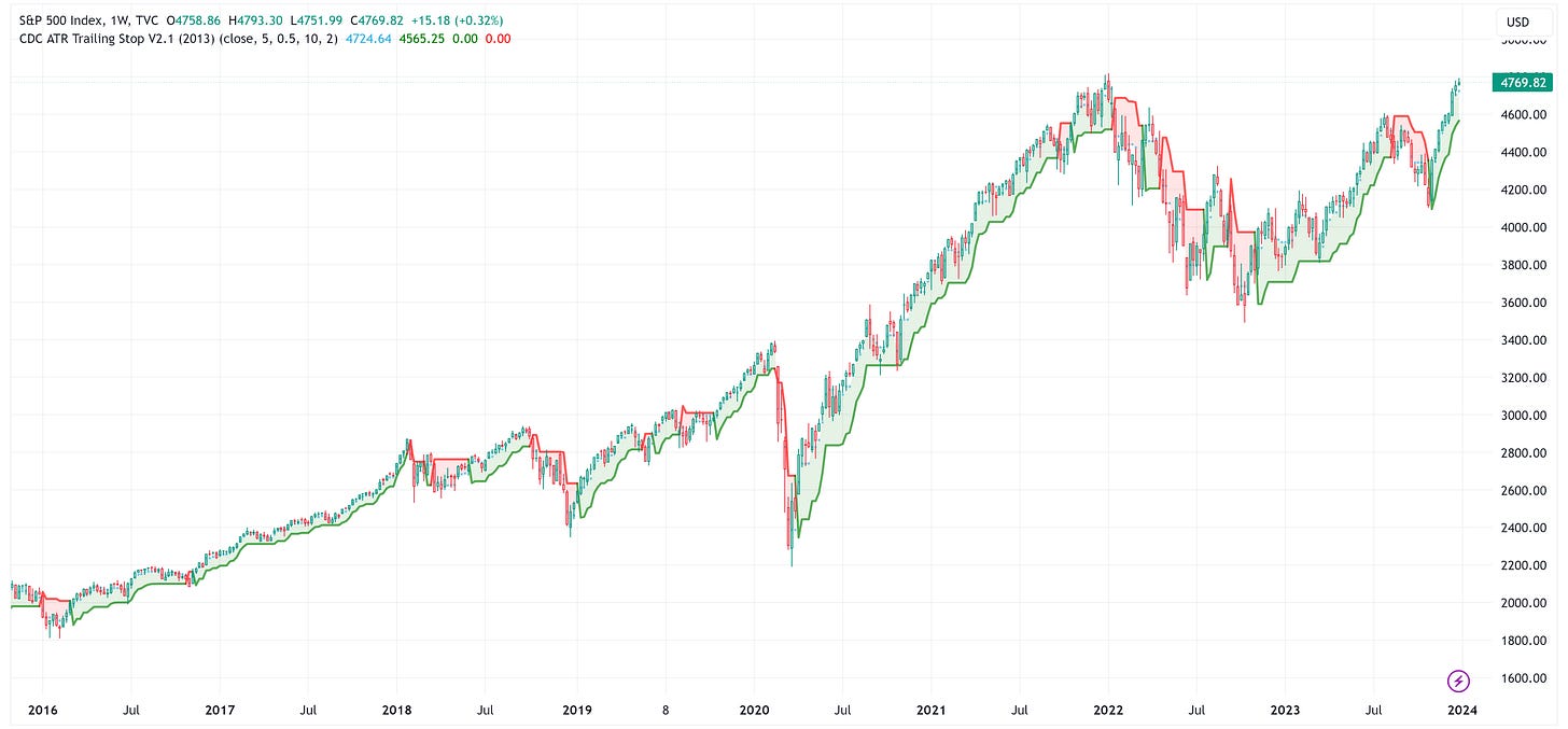
With respect to short-term trends, I like to use an indicator called a “trailing stop loss”. While no indicator is perfect, I find that this indicator is simple to use/understand and does a pretty decent job of keeping you on the “right” side of the market.
The other benefit of this indicator is that it can be used on any time frame (daily, weekly, monthly, etc.) to get a better sense of how the market is performing.
The chart below is a weekly chart and while it should be pretty self-explanatory, the idea is that you want to be long the asset in question when the price is above the green line and you want to be short the asset (or out of the market) in question when the price is below the red line.
Again, it’s not perfect, but by looking at the “trailing stop loss” across multiple time frames, it does a pretty decent job of keeping in and out of the market at appropriate times.
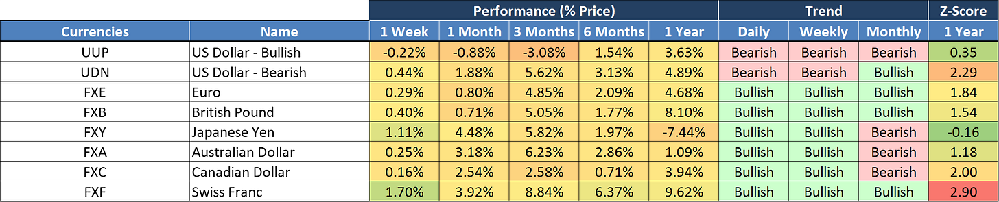
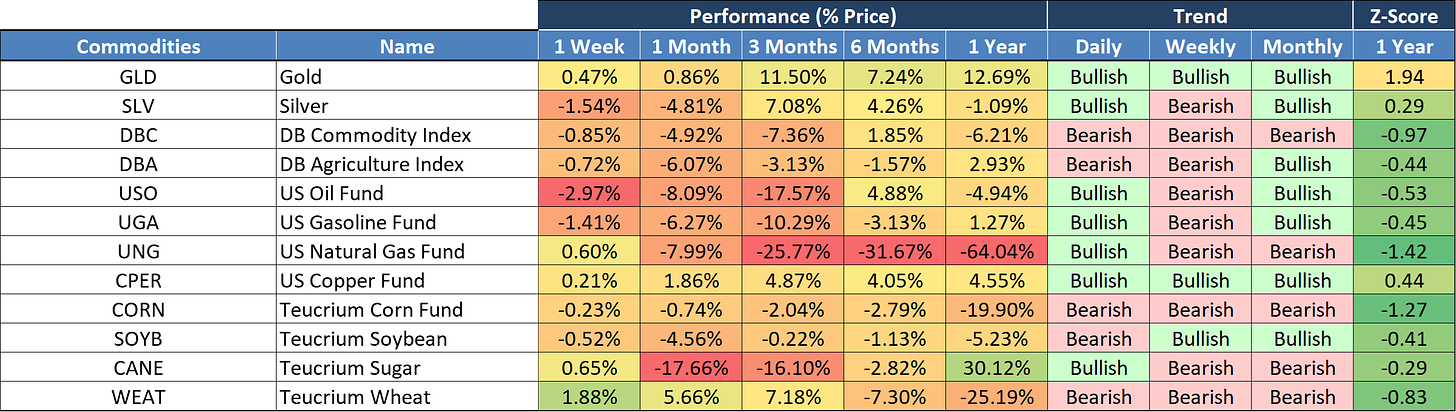
Taking it a step further, I have developed the following template to better track the shorter-term trends.
The first seven columns (through the performance metrics) should be fairly self-explanatory.
The “Trend” columns leverage the “trailing stop loss” indicator I noted above.
Instead of looking at the “trailing stop loss” on a single time frame, I am looking at it on the daily, weekly, and monthly time frames.
If the price is above the “trailing stop loss”, it is “Bullish”, and if the price is below the “trailing stop loss”, it is “Bearish”.
How can we use the Trend indicator?
If all three time periods are “bullish”, you can pretty safely say that you are in a well-established uptrend and that you would have likely benefited from having been long that asset in the period leading up to the present time.
The goal is to invest in the direction of the trend, while at the same time, keeping an eye out for when the trend may change.
Typically, when we see the beginnings of a trend change, it will usually manifest itself in the daily changing from “Bullish” to “Bearish”, then the weekly, then the monthly but I should note, that it is not always that perfectly defined.
How can we use the Z-Score?
Additionally, we can look at the Z-Score column for clues.
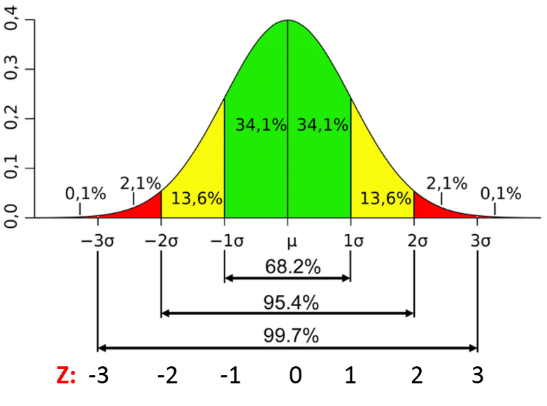
Recall, that the “Z-Score” is simply a measure of how many standard deviations the current price is from its historical mean. In this case, we are using the 1-year time period for our historical calculations.
When the Z-Score is +2.0, that indicates that the current price is 2 standard deviations above the mean price over the last 1 year.
Further, as you can see in the diagram below, a value from:
-1.0 to +1.0 encompasses approximately 68.2% of the observations.
-2.0 to +2.0 encompasses approximately 95.4% of the observations.
-3.0 to +3.0 encompasses approximately 99.7% of the observations.
Typically, when we see a Z-Score value greater than +2.0 (or more negative than -2.0) this suggests that the current price has reached a relative extreme.
This does not suggest that the price cannot continue in the same direction, it simply means that it is statistically more likely to move in the opposite direction, or sideways until some of the “overbought” or “oversold” condition is worked off.
Putting it all together.
We should start by recognizing that based on where we are in the longer-term cycle, we should expect the market to move sideways or lower over the next several years and that we will likely experience a recession or two during that time frame until the “Average Investors Allocation to Equities” reaches a trough.
With that said, we saw a very powerful bull market in 2023 that most (if not all) economists did not see coming (based on their 2023 estimates). How can we defend against getting caught offside if this happens again?
We can become cognizant of where we are in the shorter-term trend. Further, we can use this shorter-term trend model which I displayed above to spot potential market changes.
For example, if you look at the ticker “DIA” in the table above. You’ll note that it is “Bullish” across all three time frames. However, the Z-Score is +3.01.
This would suggest that DIA has been in a very strong uptrend but the current price is at an extreme high (i.e. over +3 standard deviations). Again, this does not mean that the price can’t continue higher, it simply suggests that it may need to work off some of its current “overbought” condition.
If DIA starts to move lower, we will likely see the “Daily” trend flip from “Bullish” to “Bearish”. If the downtrend were to continue, we would likely see the “Weekly” trend flip from “Bullish” to “Bearish” and so on.
The goal is to use this tool to identify tickers that may be about to turn from “Bullish” to “Bearish” or “Bearish” to “Bullish”. If nothing else, we will use this tool to take a deeper dive into the ticker in question and see what the technicals are telling us about the potential direction over the short to medium term.
Investors can then use this information to make decisions as they see fit for their portfolios and/or their clients’ portfolios.
Lastly, I previewed the US Equities table above, but I also have the following asset classes available. The goal was to capture most of the major asset classes, but if there is a ticker you would like to see added, please do not hesitate to reach out.