Hi Dbm, No victory flags to be flown here with the general markets being down big time yesterday. I'm not here to be in any of that just putting it as the charts are saying if right or wrong not to worry in the long run.
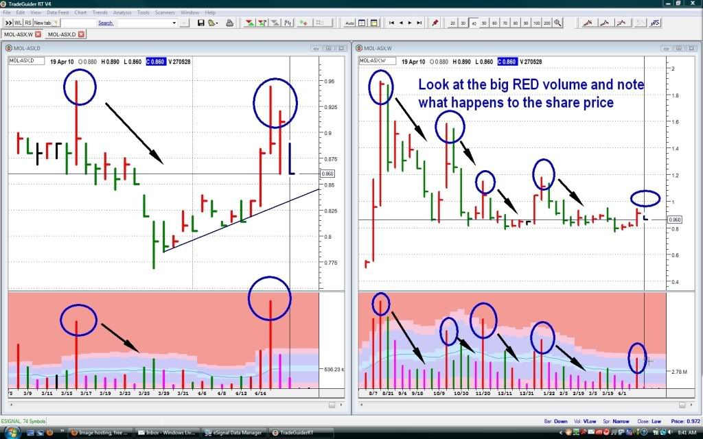
I've updated the charts this time being a daily and weekly side by side.
The only thing on these charts I would like to highlight is if you just look down at the bottom in the volume area and see all the big red volume spikes and note what happens to the share price afterwards.
Red volume and share price bars simply mean that they are finishing higher than the previous bar and we know that weakness can be hidden in these.
I'm not going to explain my thoughts on this, everyone can come up with their own thoughts on why but just would like to highlight it via the chart, but also note that the volume spike for last week was actually the smallest of late, also some of my circling on the chart overlapped several bars - it was meant to only highlight the big red ones. lol

- Forums
- ASX - By Stock
- MOL
- mol chart
mol chart, page-14
-
- There are more pages in this discussion • 5 more messages in this thread...
You’re viewing a single post only. To view the entire thread just sign in or Join Now (FREE)
Featured News
Add MOL (ASX) to my watchlist
Currently unlisted public company.
The Watchlist
EQN
EQUINOX RESOURCES LIMITED.
Zac Komur, MD & CEO
Zac Komur
MD & CEO
SPONSORED BY The Market Online


