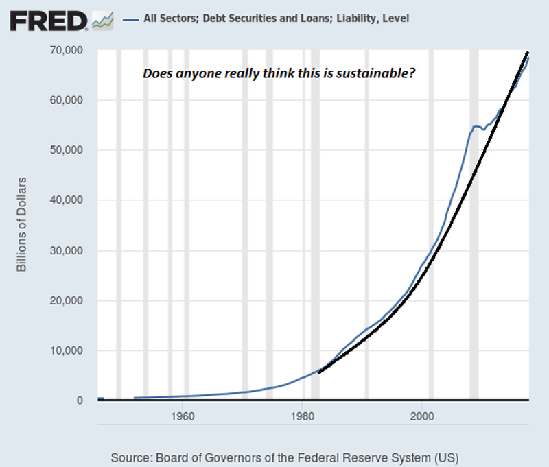
Sorry about the small size - enlarge it if you're able to.
This is the Fed Reserve chart of All Sectors: Debt Securities and Loans; Liability and Level.
.
.
.If you think it's not really all that scary, note this : -
.
.
The little 'hiccup' on the blue line IS the 2008 GFC !
dub
ps. That slow, small linear increase of debt shown occurring from the chart start suddenly changed nature,and gear to morph into a parabolic one.
This change began straight after President Nixon turned the US$ into a fully fiat currency (backed by absolutely nothing other than Government's promise) when, in August 1971, he decoupled the US$ from its gold backing ..... " ... as a temporary measure, ,,, "
And pigs fly!