Let me try to explain my thoughts about this chart that I posted yesterday.
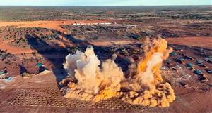
The iron ore price as depicted by this chart shows clearly that it is in an area that has seen prices top and and is clearly pointing to lower prices. Can we agree here?
The same applies for Coal and other metal prices.
The boom is clearly over despite the confusion that some would like to create in order to offload their over leveraged assets. With the exception of another injection of printed crack into the already overheated economies. The deaf, dumb and blind Bernanke will most likely be followed blindly by other dummies from the ECB, BOE and RBA etc. Widening the gap between the super rich and the middle class. Living in a fools paradise.
They are simply staving off the inevitable.... It is only a matter of time!!!!
The reason rents are going up is because of this very reason. Fewer people can afford to buy a house and are FORCED to rent! This is NOT a sign of a strong housing market, as you may know, when house prices fall rents will follow.
As a property investor in Perth, you may have had the best year since 2007. However, do you expect this to continue indefinitely? Take another look at the Iron Ore chart.....
If the price of Iron Ore falls by 50%, rest assured that house prices will match this and exceed by some margin. The reason is that the economy (world economies) will slow and unemployment will rise. It’s that simple.
Now, don’t get me wrong. It matters little to me personally which way the market goes as I have taken extraordinary measures to inflation proof and protect my assets from these Central Banksters and Political meddling. And increasingly, there are property assets that are coming under pressure that are worthy of my attention. But not quite yet, I think.....
- Forums
- Property
- parallel universe
parallel universe, page-7
Featured News
Featured News
The Watchlist
NUZ
NEURIZON THERAPEUTICS LIMITED
Dr Michael Thurn, CEO & MD
Dr Michael Thurn
CEO & MD
SPONSORED BY The Market Online


