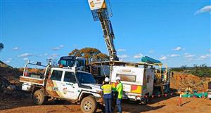
Below is an example of some real data from the Corryong area. The ma
p shows potassium data; red areas have high gamma ray counts and the blue areas have low counts.
Another way to display radiometric data is to combine three datasets on the one picture using a red-green-blue ternary ratio. Each of the datasets are displayed using a different basic colour, which when combined make a colourful display with each shade representing different relative amounts of potassium, thorium and uranium. Usually the colours are displayed as follows:
Red = potassium
Green = thorium
Blue = uranium
I have read that the radiometric surveys were promising from erongo, however does the red in the pictures represent potassium or uranium?
Below is an example of some real data from the Corryong area....


Add to My Watchlist
What is My Watchlist?