I am trying not to step out of my box too much, but thanks red for your weekly synopsis.
For quite a while I have been trying to get my head around p&f charts as it seems they have something to offer. Anyway, mine was oddly different from yours, as far as I can tell stockcharts use a logarithmic scale and the one shown below is non-log but all the other parameters are the same. From what I understand log charts are better over long periods and large price differences, anyhow mine has a much more bullish note to it if that is of any interest.
Keep up your great work.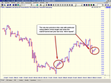


Add to My Watchlist
What is My Watchlist?
 (20min delay) (20min delay)
|
|||||
|
Last
8,570.4 |
Change
-9.700(0.11%) |
Mkt cap ! n/a | |||
| Open | High | Low |
| 8,580.1 | 8,593.6 | 8,558.3 |
| XJO (ASX) Chart |