I know nothing about charting.Can anyone please decipher the chart on Pacrims Website?Link is: http://www.pacrimenergy.com.au/news/07/PRE%20Analysis.pdfThanks in advance
1CG One Click Group jumps 4% after ending quarter with $2.4M in cash; $1M in revenue and 150K+ users on board
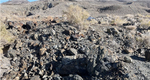
KOB Koba, formerly a cobalt player, gears up to become newest explorer in the uranium state: South Australia